
Ways to present site analysis
Mapping is an essential tool in the curriculum of architectural schools and later on the field of work. It is used to represent the built environment and inform design ideas through the development stage. Mapping is a process of visualising spatial relationships and creating representations of the built environment using a variety of techniques and media. Architectural mapping encompasses a broad range of skills, including surveying, drafting, rendering, and modelling. You learn how to create accurate and detailed maps and plans of existing buildings and landscapes, as well as design proposals for new structures. You can also learn how to use mapping tools to analyse the context of a site, including topography, climate, and cultural and historical influences.
In today’s post we’ll be covering the different maps you can produce in order to help develop, strengthen and influence your design projects. So let’s begin!
Noise Maps
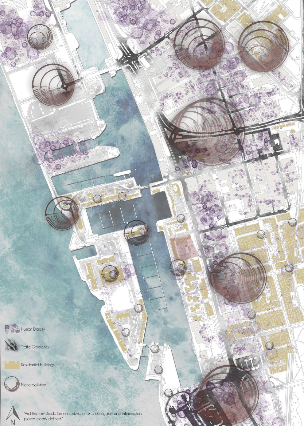
A noise map acts as a graphic representation of sound levels, typically shown in ranges of decibels (db), within a certain area for a specific time period. This type of mapping shows the acoustic environment of an area including both natural and manmade sounds, i.e birds, traffic, construction etc. You can use this type of mapping as part of your site analysis to identify issues to respond and mitigate in the design process through form, orientation and materiality. Creating a noise map is crucial to the site analysis when a site is located in close proximity to a larger infrastructure like railways, airports and arenas. In addition to this, if you attend the site yourself, you can periodically visit to collect first hand data using a sound level meter. Otherwise, you can use averages found through second hand sources. Visually, the levels of sound are best represented through a series of colours that correlate to a range of decibels in the key. It’s uncommon with noise maps for the key to consist of exact decibels, as the amount of sound from one source is variable, at different times, on different days. This representation will explain the source of noise and the numerical value of just how loud the noise is.
An alternative way of interpreting noise data as a map is through a more vague and uninformed method where you don't use any numerical values and you show how far the noise is travelling from the source. This can be useful in justifying the lack of impact of what might be classed as a ‘noisy’ area near your site and it can also show how noise is loudest at the source and will reduce as it offsets further out. Whilst the first method of mapping is more commonly used, this is an alternative to exhibiting an analysis without exact data, but with educated assumptions.
Here's an example of what a noise map might look like —>
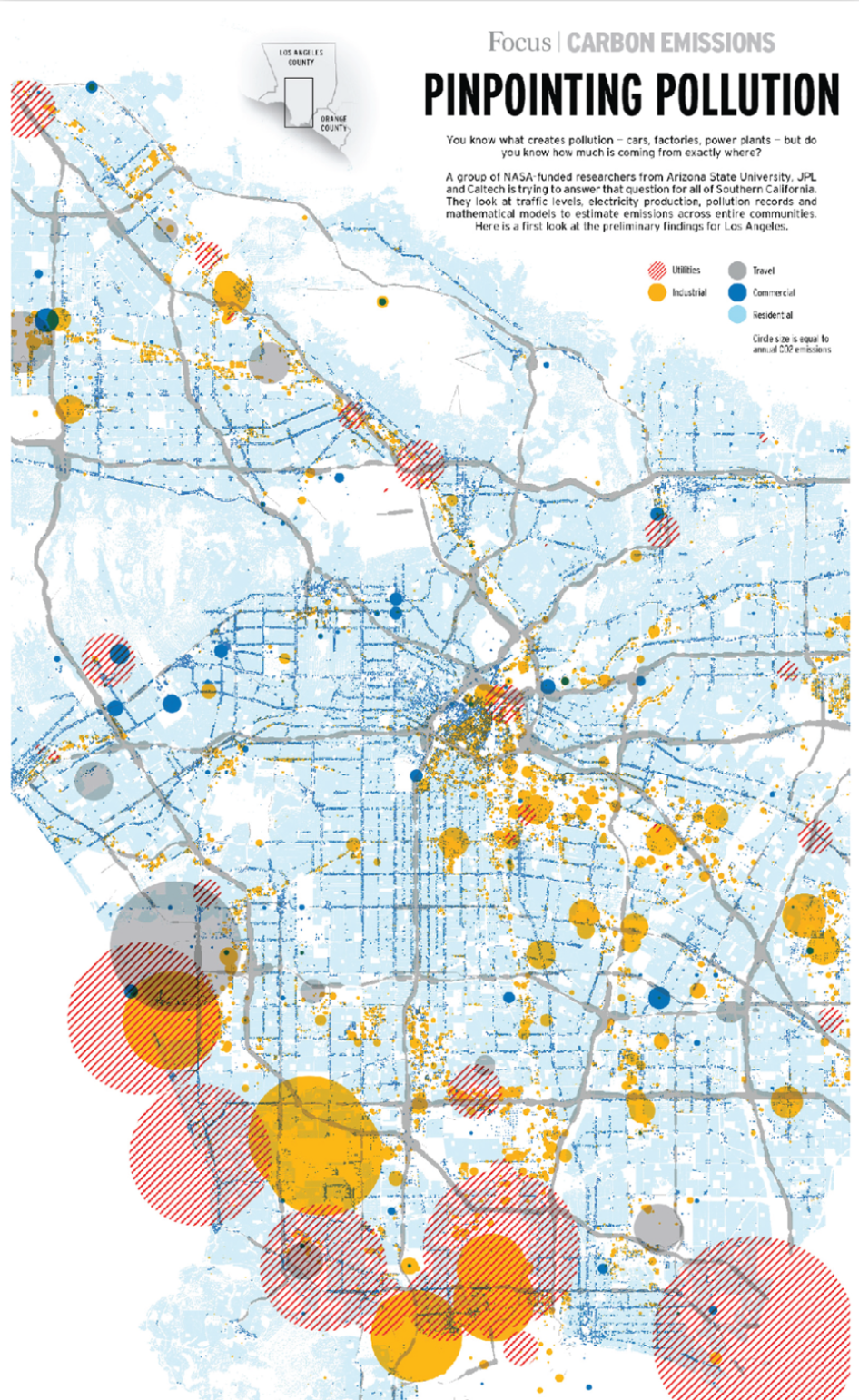
Air Pollution Maps
As an increasingly popular topic amongst sustainability, it has become more common for the built environment to look at air pollution as a site condition and respond to the situation through design of form, materiality and concept. You might be looking into air pollution around your site to design your proposal as a mitigating tool or in response to the levels of pollution. It might even be something as simple as collecting data to design a facade that filters the air, or use a material which will have less of a negative contribution to the local environment. Collecting air pollution data can be done through regular visits to the site, using a sensor at specific times and days. to keep everything as consistent as possible. Your map should aim to show areas of high and low pollution as well as existing systems to mitigate the air pollution i.e emission control zones, facades etc. This data can then be visually presented in the form of coordinated colours to the severity of pollution in certain areas. This could be determined by colour, radius or quantity of markings in one location. The same data collection and mapping techniques can be applied when measuring and creating a visual for indoor air pollution.
You can also use sensors to collect large ranges of data which can then be mapped using GIS software, which will allocate coordinates of location to the data point. Whilst this is a much more advanced way of creating a pollution mpa, it is a more accurate method and will use a larger pool of data.
Here’s one way you can visually present the pollution data —>
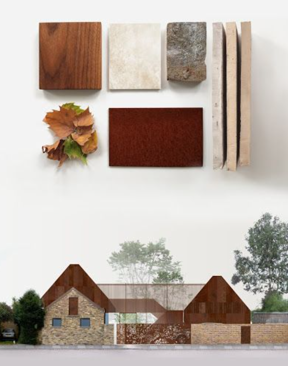
Materiality Maps
Potentially one of the first types of mapping that comes to mind is materiality studies. The aim of this map is to give a better context of what the surrounding context of a project site looks and feels like. The visual appearance may come quite self-explanatory but the feel of a site links to the textures which may be overlooked when you think of a materiality study.
We would always recommend documenting this information during the research process of your project regardless of your concept because you will always be faced with the stereotypical, “how does your proposal sit within the existing site context?” and your material choice is a design decision that you should bring up in your answer. Knowing what already exists on site in conjunction with what you’re proposing will start to raise questions such as, “is it blending amongst the neighbouring builds?” or “am I going to set my proposal apart from the site context and use contrasting textures to create an experiential facade?” and inevitably reach an intricate level of detail.
Here’s are some examples of mapping materials —>

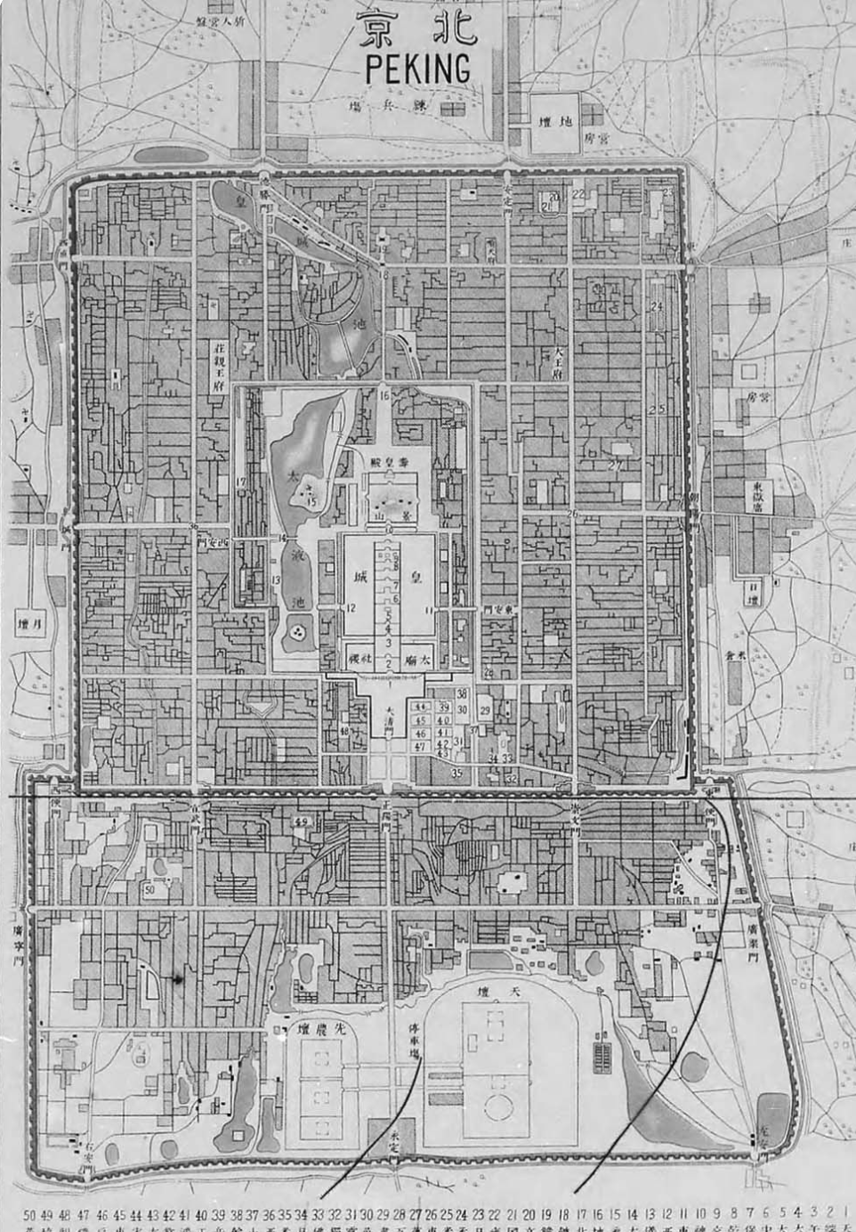
Historical Maps
Among the new buildings emerging in our environment, there are also the relics which stand strong, full of rich reminiscence of the past. The surrounding history of your site context can play a big part in the direction of your proposal. You’re not inclined necessarily to draw moments from the physical architecture but delve further into the decisions behind the design in correlation to the historical context it was being built in. You’ll discover that subjects such as politics, psychology, religion and more may overlap and point in the direction of why a certain room or circulation route was designed the way it was. Reason being, it’s really good to familiarise yourself with what once existed and still exists in the surrounding site context.
You may include an urban circulation system that once existed and how it has changed overtime. You could also look at the street facing facades along an old street to see if there were deliberate choices made in response to a public facing elevation. You could also join a historical mapping exercise with materiality and uncover the methods of construction back when the building was being constructed and the types of technologies and materials that were commonly used. Something interesting that may be uncovered is the limitations that were once faced which now, with the help of advanced technology, may be achievable. In a sense, the historical context can generally help solidify your decisions across a range of topics: typology, client usage, material choice, form, and more.
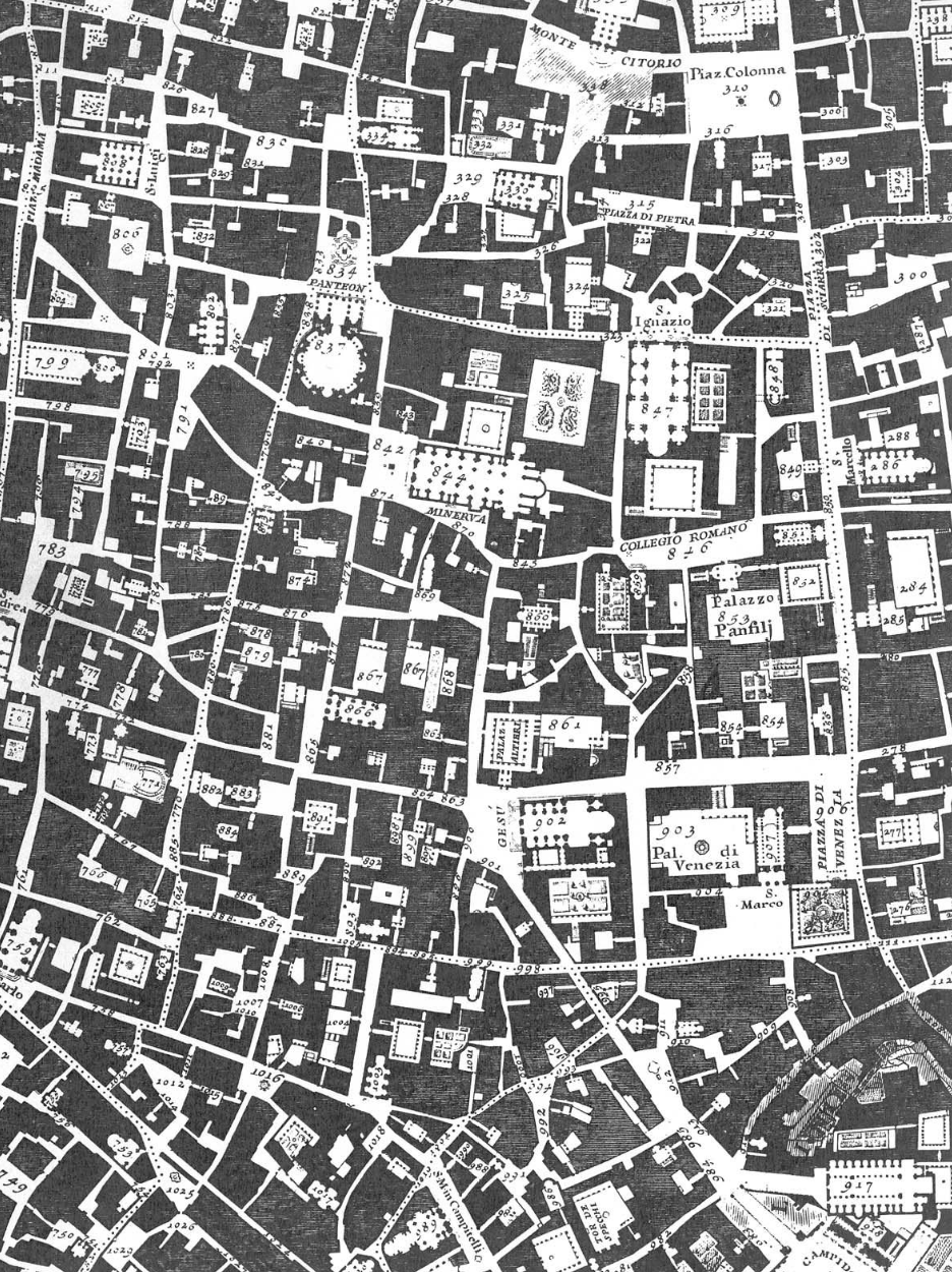
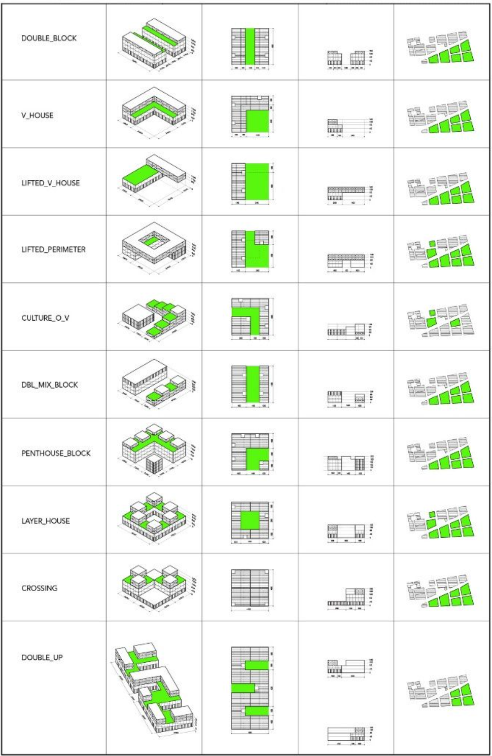
Typology Maps
In other words, what servicing buildings already exist. Essentially, when you are designing you do not want to be making a replica of an existing service. Even if you are, you really need to have a clear and detailed understanding of what exists in the surrounding context and its efficiency in achieving a good output for the community. When you look at the typology in an area you could categorise in different ways: Architectural styles, purpose of the building (school, hospital, entertainment, etc), form, and others. You can incorporate this into your design process and more importantly your narrative. For example, if you were to be designing on a plot of land in Canary Wharf, a district filled with financial corporate buildings, one of the first questions that comes to mind is what the area has to offer in the form of entertainment for the workers after 5pm? If I want quick answers for this question, all I’ll have to do is turn back to my trusty typology map and help fill in the gaps of my research.
Here is an example —>
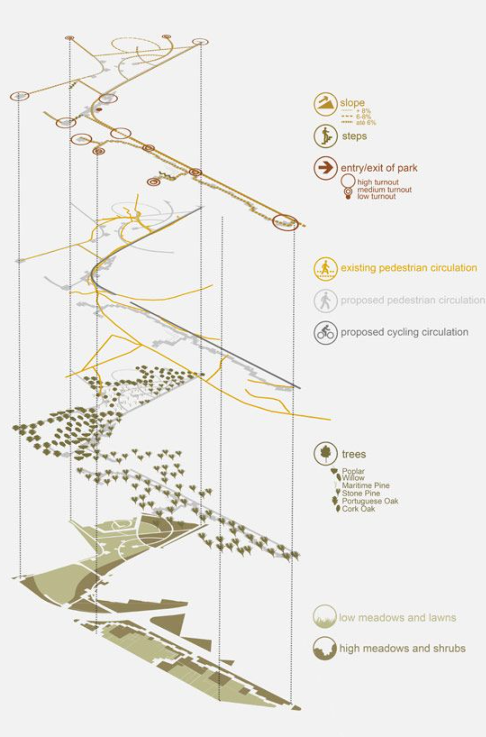
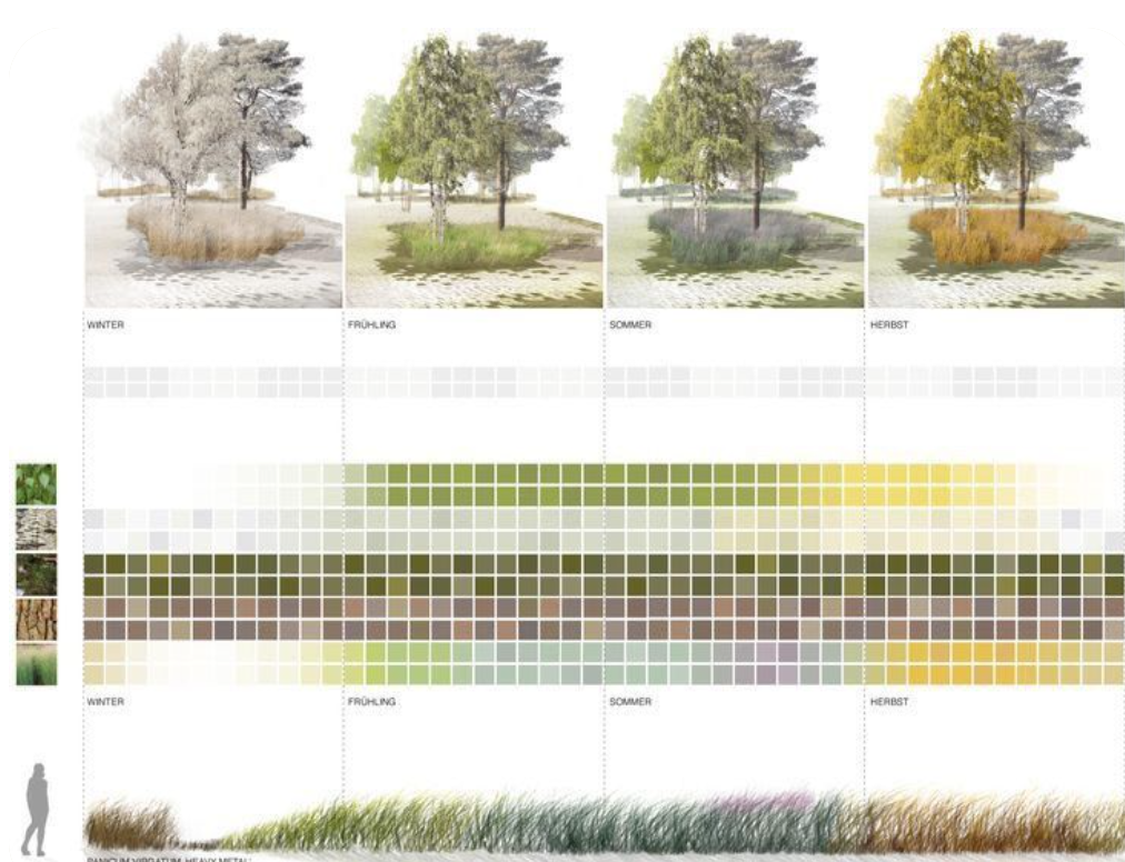
Vegetation Maps
Vegetation mapping is more commonly used in the context of landscape architecture and urban planning to identify and analyse the distribution and characteristics of different types of vegetation within a particular area. The aim of vegetation mapping is to understand the existing vegetation cover, the distribution of different species, and their ecological functions, which can be used to inform design decisions. It’s key to understand if and how your proposal will be contributing to the ecological surrounding even though you may be designing for humans especially when the climate crisis is an eminent topic of discussion in construction.
Vegetation mapping involves the collection of data on the location, species, size, and health of plants within a given area. This information can be collected through site surveys, remote sensing techniques, or a combination of both. Site surveys can involve fieldwork, through walks on site whilst recording the relevant information. You can then compile all this information into a vegetation map, which shows the distribution and characteristics of different types of vegetation within the site. The map can be used to identify areas of high biodiversity or ecological significance, as well as areas where vegetation may need to be restored or enhanced. This can, again, become an indicator for your design concept or a branch off of it and a method in tackling the concerning change of climate.
Beyond the significance of these types of maps at an educational level, vegetation mapping is a useful tool for architects and planners because it provides valuable information about the ecological functions of different types of vegetation, such as their ability to provide habitat for wildlife, reduce chances of floods, or mitigate the urban heat island effect. This information can be used to inform design decisions, such as the selection of appropriate plant species, the location of green infrastructure, or the design of green roofs and walls.
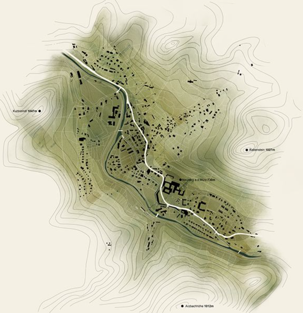
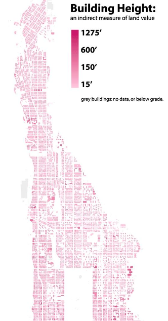
Building Height Maps
Mapping building heights as part of site analysis can be useful for a variety of reasons. One of the main insights it provides as part of your research is an overview of the site context. It can be useful in identifying existing structures, such as tall buildings that might cast shadows on the site or obstruct views, or low-lying buildings that may provide a visual buffer. When designing a building, it is important to consider the heights of the surrounding buildings to ensure that the proposal responds to site context and the urban fabric at a larger scale. As a result of the products of this map, you can begin to consider and discuss how the surrounding buildings impact the natural light, views and environmental conditions around your design proposal,
One of the most efficient ways of mapping building heights is through creating a 3D model using imported typography and contour line data from any online application (i.e digimaps) and extracting data into a 2D form. This 3D model should include the height and size of each building, as well as their relative positions to each other. The model can also be used to create a visual representation of the skyline, which can be used to compare different buildings and architecture in the area, which we don’t see often or you can extract the data from the 3D model onto a 3d map of the area and code the building heights into categories which correlate with shades or colours in general. His way you can categorise by building typology (i.e skyscraper, bungalow etc.), number of stories, or by height in rages of metres.
Here’s one example that you can take inspiration from —>
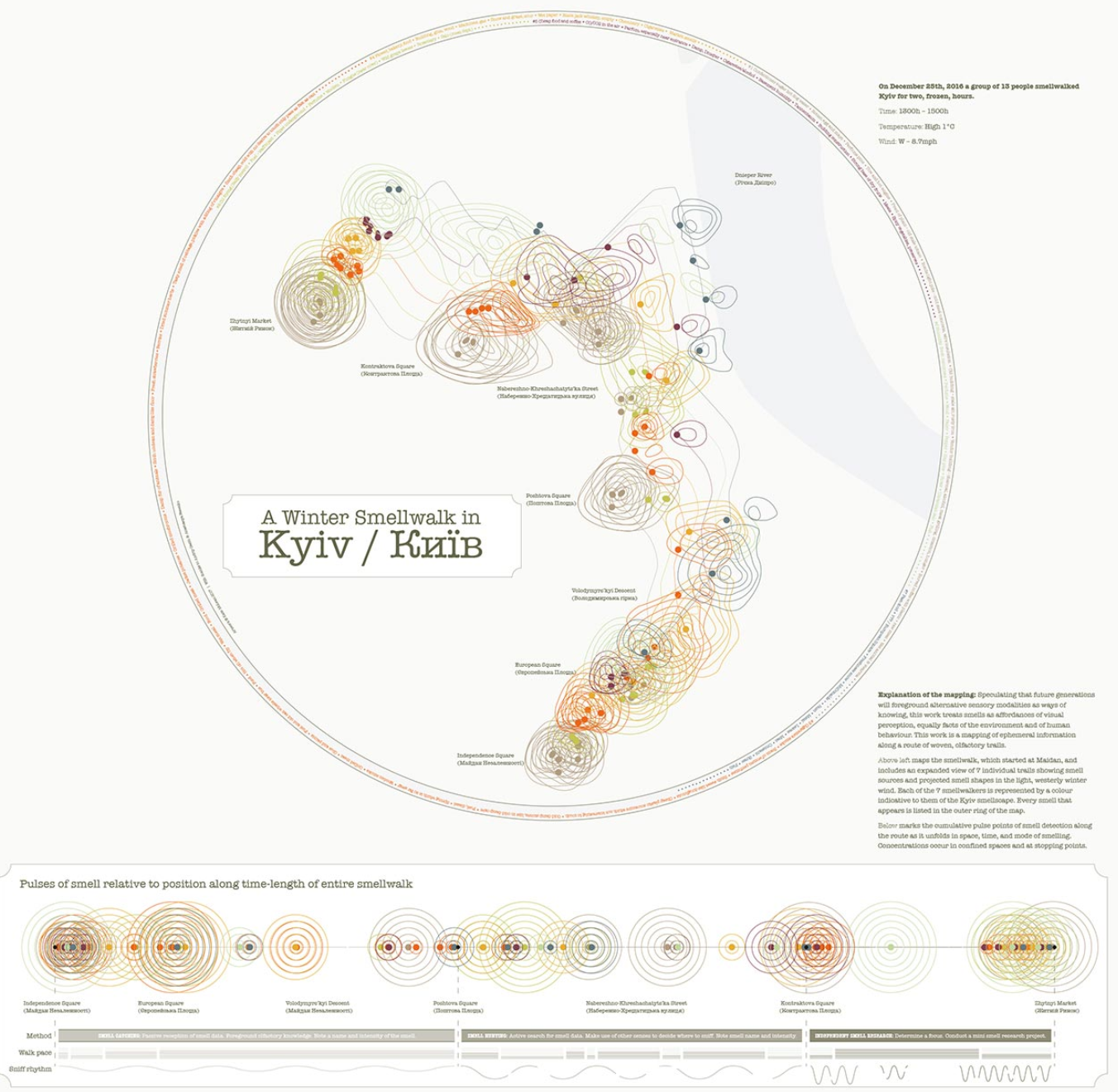
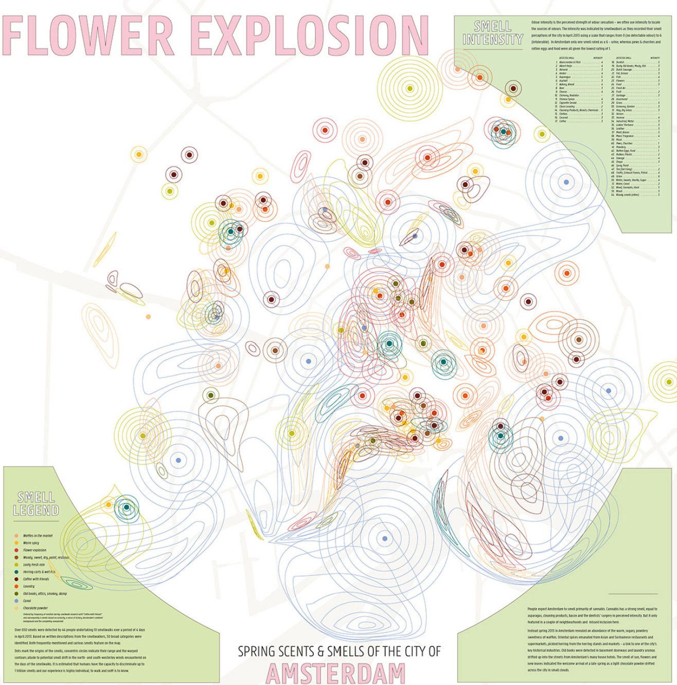
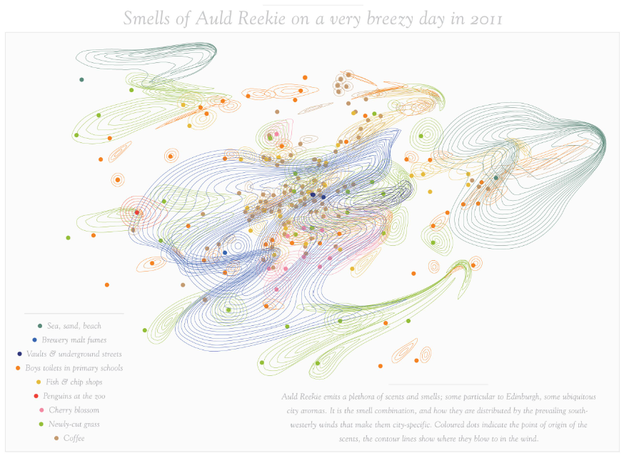
Mapping smells
Whilst this may sound extremely weird, just trust us on this one! Mapping smells is not something which you do as part of every site analysis or for every brief in general, however when you do need to visually show a sense like smell there’s a few ways to go about it. Firstly, you might be thinking why would I map smells? Well, if your project focuses on olfactory experiences, creating scent palettes for a space, or has a programme which relates to the surrounding which generates a mixture of scents, it can come in handy. In addition to this you might be using the scent mapping to help strengthen an argument in relation to your design, i.e creating more comfortable and pleasant spaces or contributing research on scents that reduce stress, increase productivity for your project use etc.
This is one of the many maps that you would generate firstly by visiting the area and recording the smells and the location of the source (i.e landfill, waste, food, nature etc.) You can then display this information, through a two-dimensional map or a three dimensional model which you present as a 2-d map. Both methods can include the location of the scent sources, the pathways which the scents will travel and the areas in which the scents will be dispersed. The map can also include information about the strength and duration of the scents, which can be shown visually through the size of circles/rings around the source. As smell is something which can disperse throughout the atmosphere, your map can look really fluid and full of movement! Here are some examples of what a noise map might look like.
We hope this post was informative in summarising the different types of mapping which you can implement during your site analysis to improve your research. Even though we have shown examples don’t feel limited to the representation of these different maps. They are just one of many ways which you can go about displaying data visually, so be as creative as you like! There are many other elements which you can map, just remember to be selective and only map what is useful in informing your project,
If you enjoyed this post, why not share it with a friend? You can also check out our other content by rummaging through the website for more tutorials, experiences and guest posts or by following us on Instagram @archidabble