
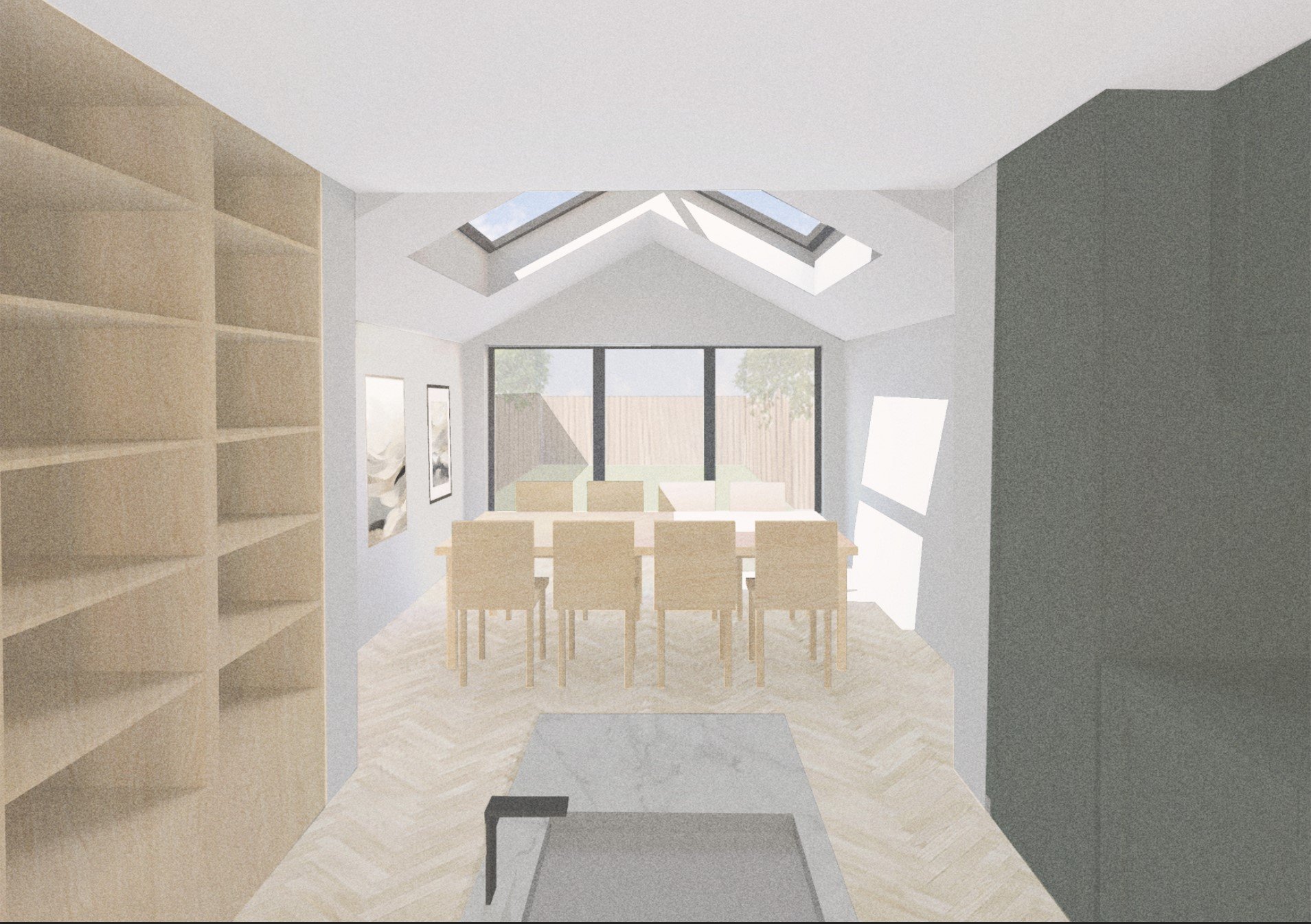
Internal Photoshop Render Walkthrough
During architecture school we learn all the basic tools with three dimensional modelling, Adobe suite programs and other software, but often find it difficult to find the time and support to develop these skills in relation to each other, to create strong visuals. When it comes to rendering, you will often hear people using softwares to produce final images, which can be very efficient, but no one talks about utilising your existing skill set in Photoshop to create a render to the same quality and standard. One thing to bear in mind is the style and outcome you want to achieve with the image you are creating. Similarly to the way that some rendering programs have a hyper realistic style, photoshop achieves a specific style.
We recently created a tutorial on how to produce an external photoshop render from a view which a lot of you guys found very helpful so we wanted to take it to the next step and walk you through how to take a simple view, extracted from a 3d model, and turn it into an internal render using Adobe Photoshop.

Our Starting Point
To begin with we want to have a three dimensional model. Typically when creating an internal visual, I like to model everything that is set, so for this example it would include joinery, kitchen units, wall positions, punctured holes for rooflights, soft seating and any other openings for windows and doors. All the other small items, decorative objects and people, I prefer to add at a later stage when rendering in Photoshop. The items you model don't have to be too elaborate or detailed, it can be pretty simple as long as you get an idea of the volumes and perspectives. I usually use rhino and import CAD blocks that already contain details on the surfaces of the object, however for this example I will be using microstation.
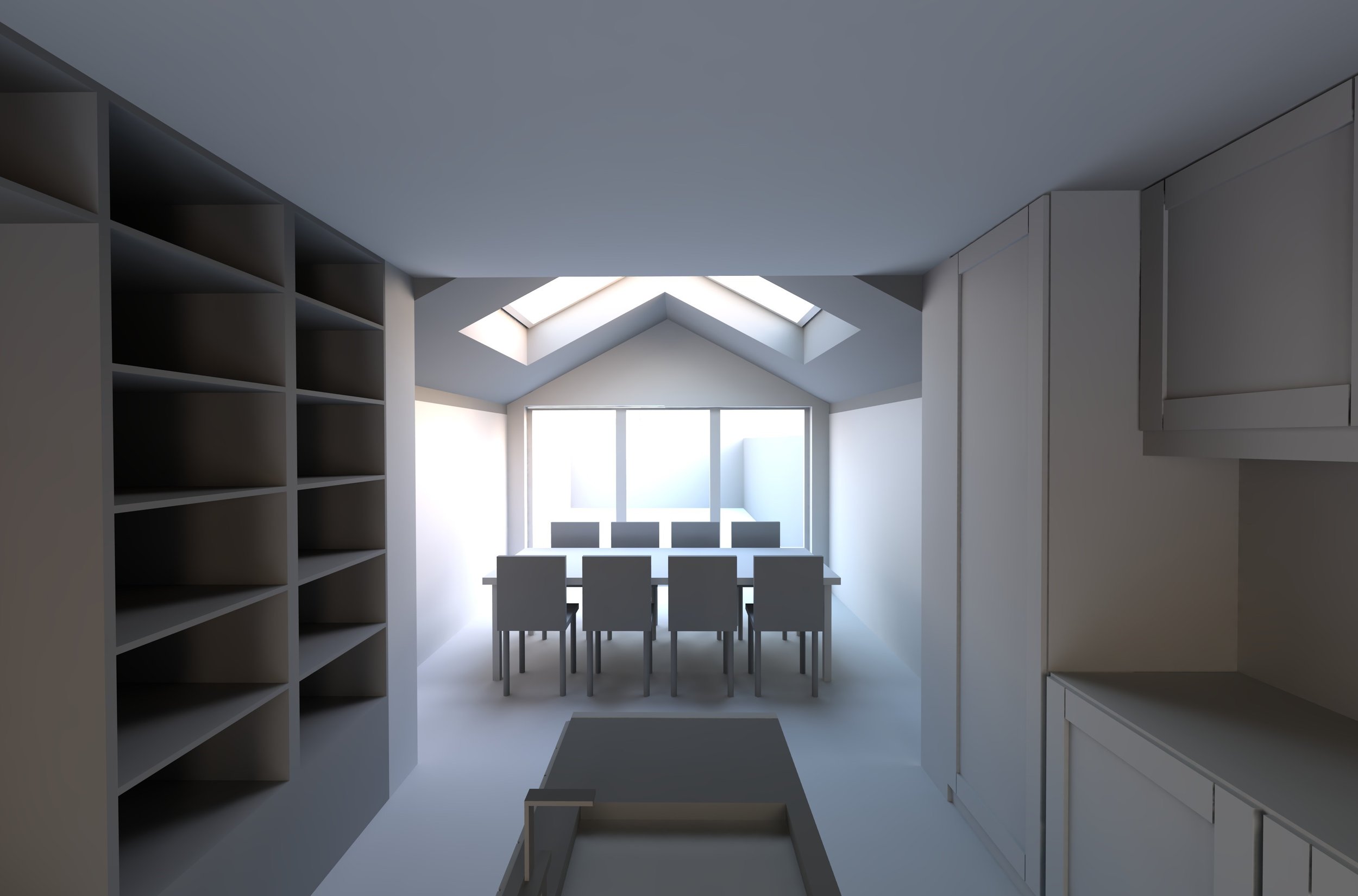
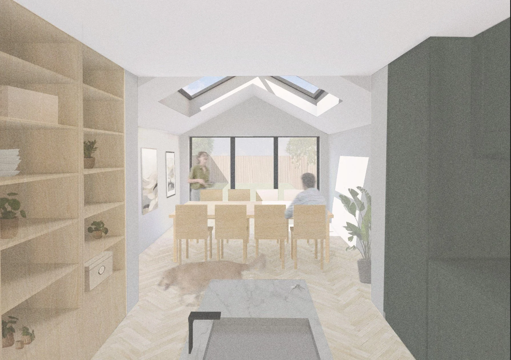
From this simple model we want to extract a base render image [3], which would be from the desired location within the model. You want to make sure you align your camera view to be at the height of an average person (I typically set it somewhere in between 1.60-1.70m) so it looks like it's from eye level, which contributes massively to the effect of the project. Once happy with the location, we use the ‘render’ option to create the base image. I usually avoid creating an image that’s set in an outline or 'pen’ view so we can avoid starting our render on a white background and instead start with a set tone for the view, which will also have an outline for all the main objects in the view. When getting this view you want to be mindful of where your vanishing points are and the perspective of your image, as this will come in handy later on. Which software you use to model doesn’t make a massive difference as long as you can extract a similar image.
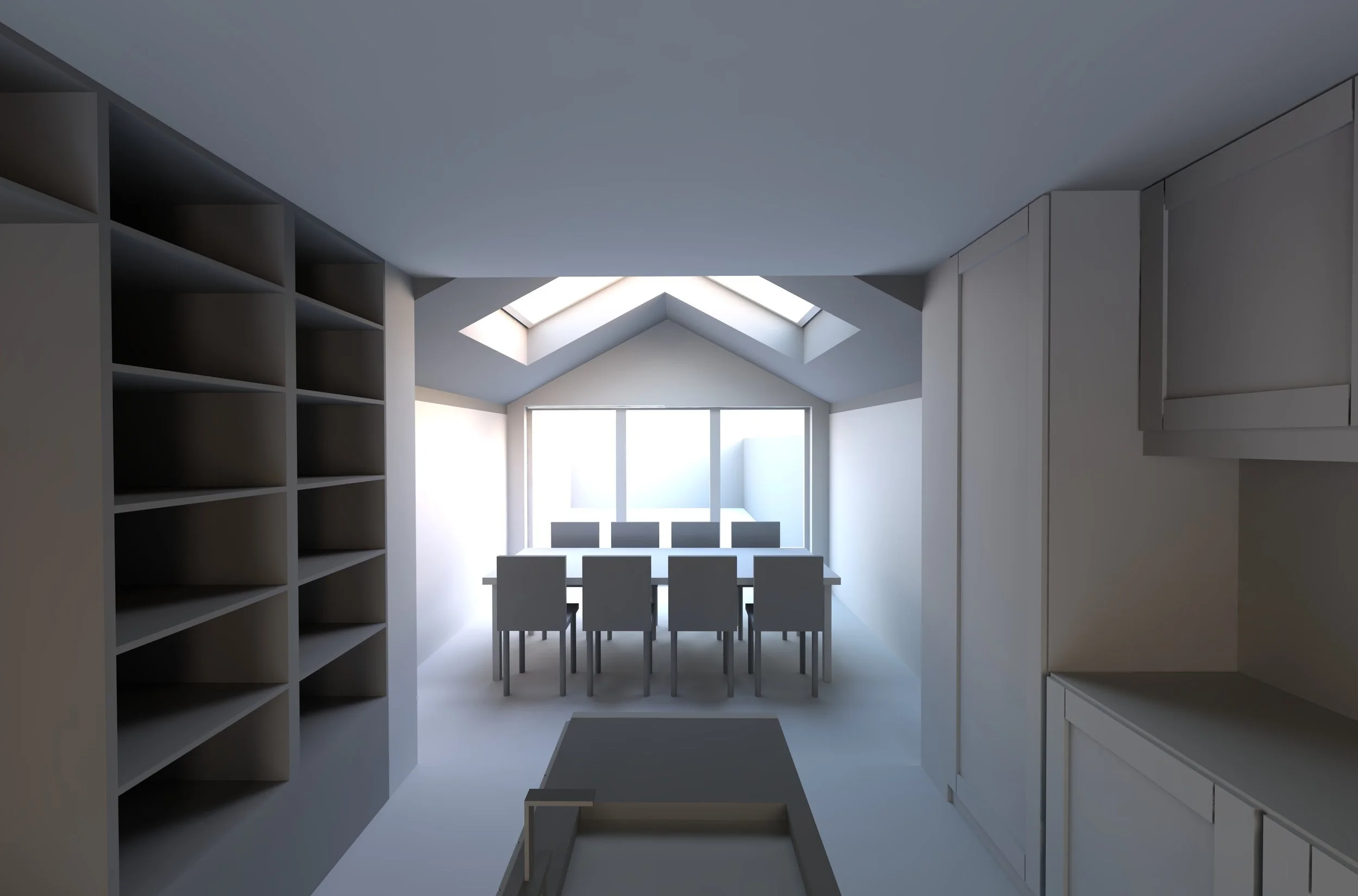
In addition to this base image, you also want to generate a ‘shadow’ image from your model [4]. When doing so, make sure you do not alter the placement of your view and that you can take it from the exact same location, so when layering the images later on they will fit perfectly on top of each other. In the software I used to make this model there is a solar option where I can set the solar position and essentially determine the shadow I want, specific to the time of day. One tip when doing so would be to generate a shadow that looks good and one that sits well with the objects in the space. Ideally you want to avoid picking a shadow that is unrepresentative of the actual space or one that can be confusing . Creating this shadow image is going to bring in a lot of the depth and realistic feel for the space later on.
3
Moving into Photoshop
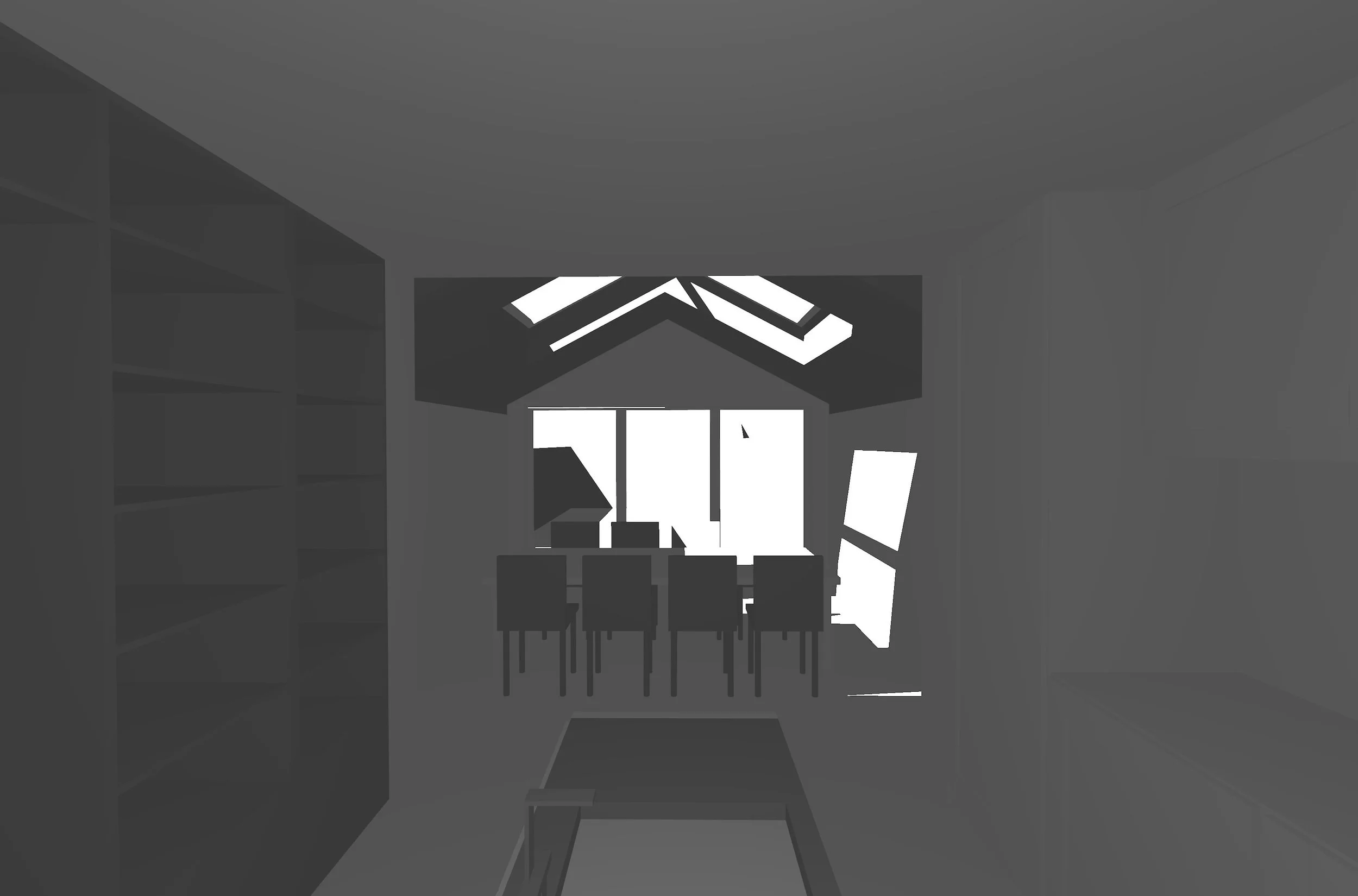
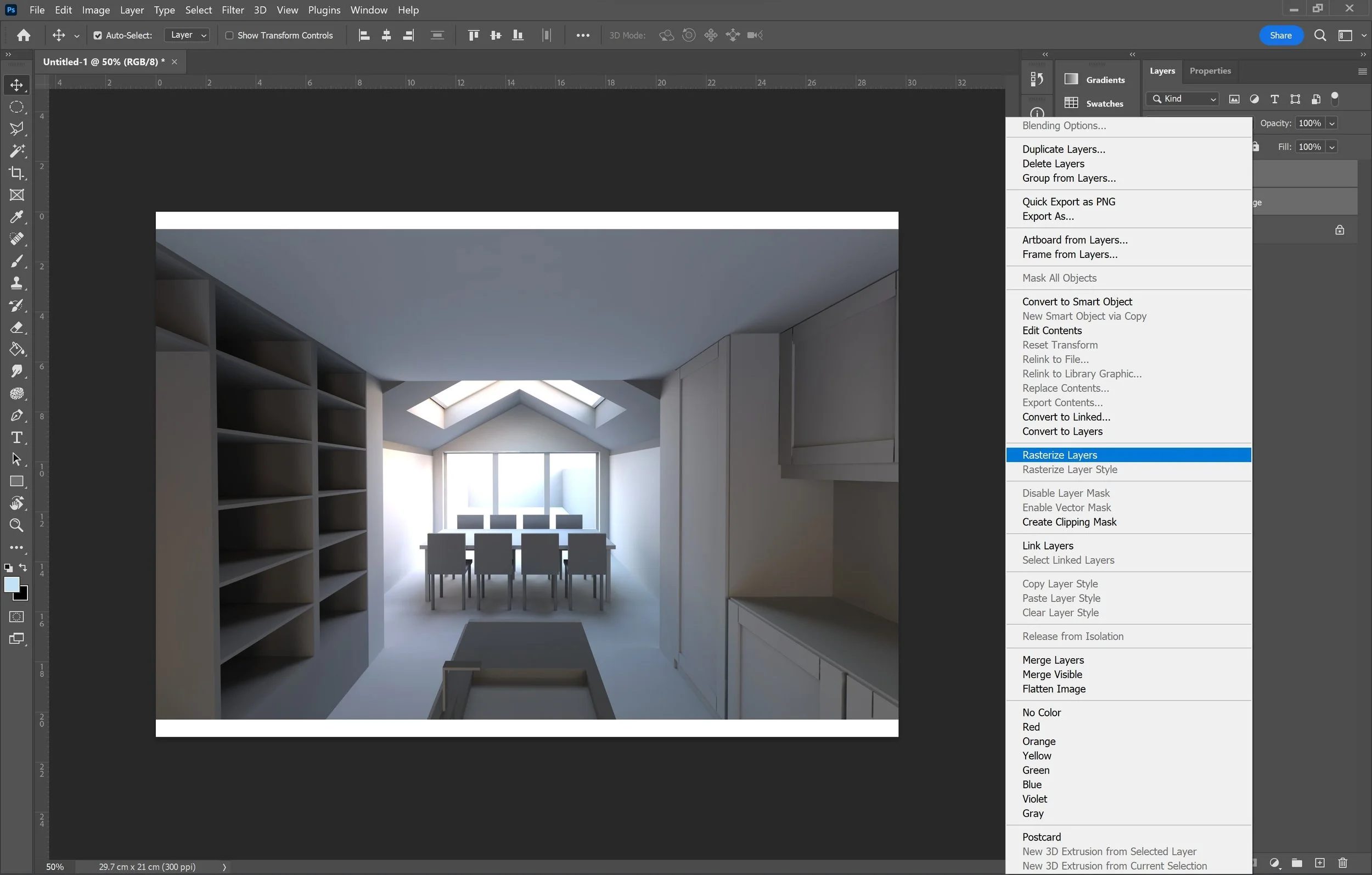
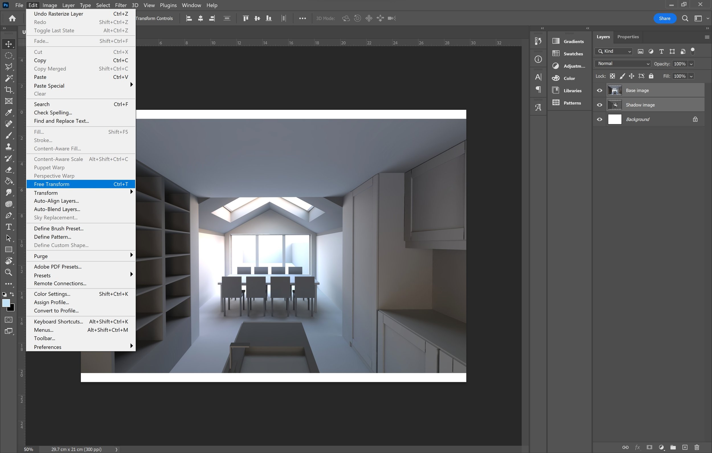
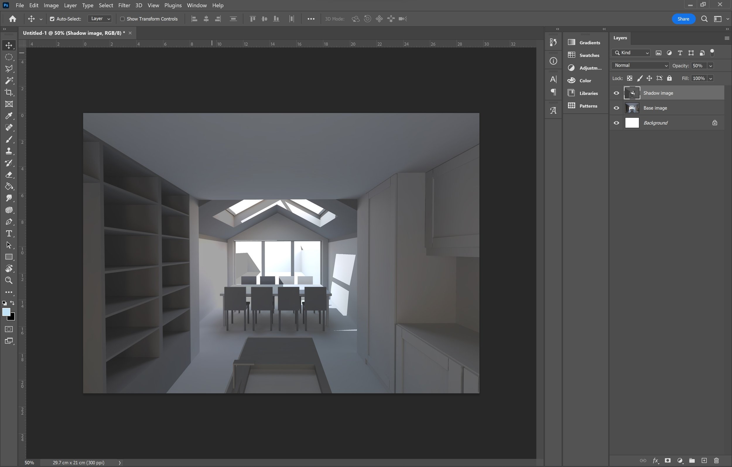
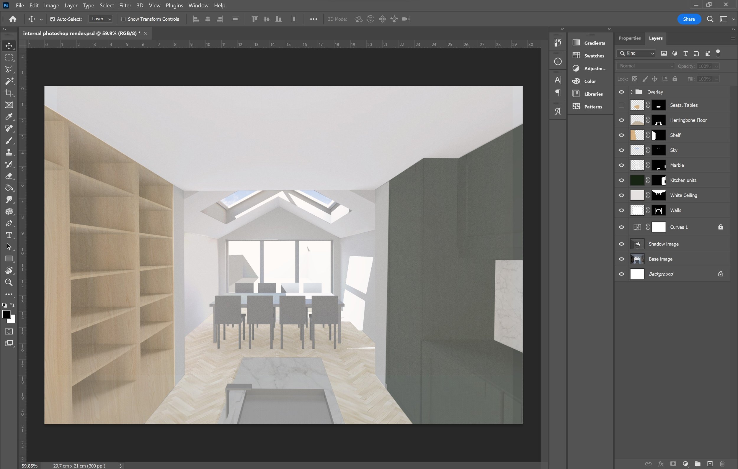
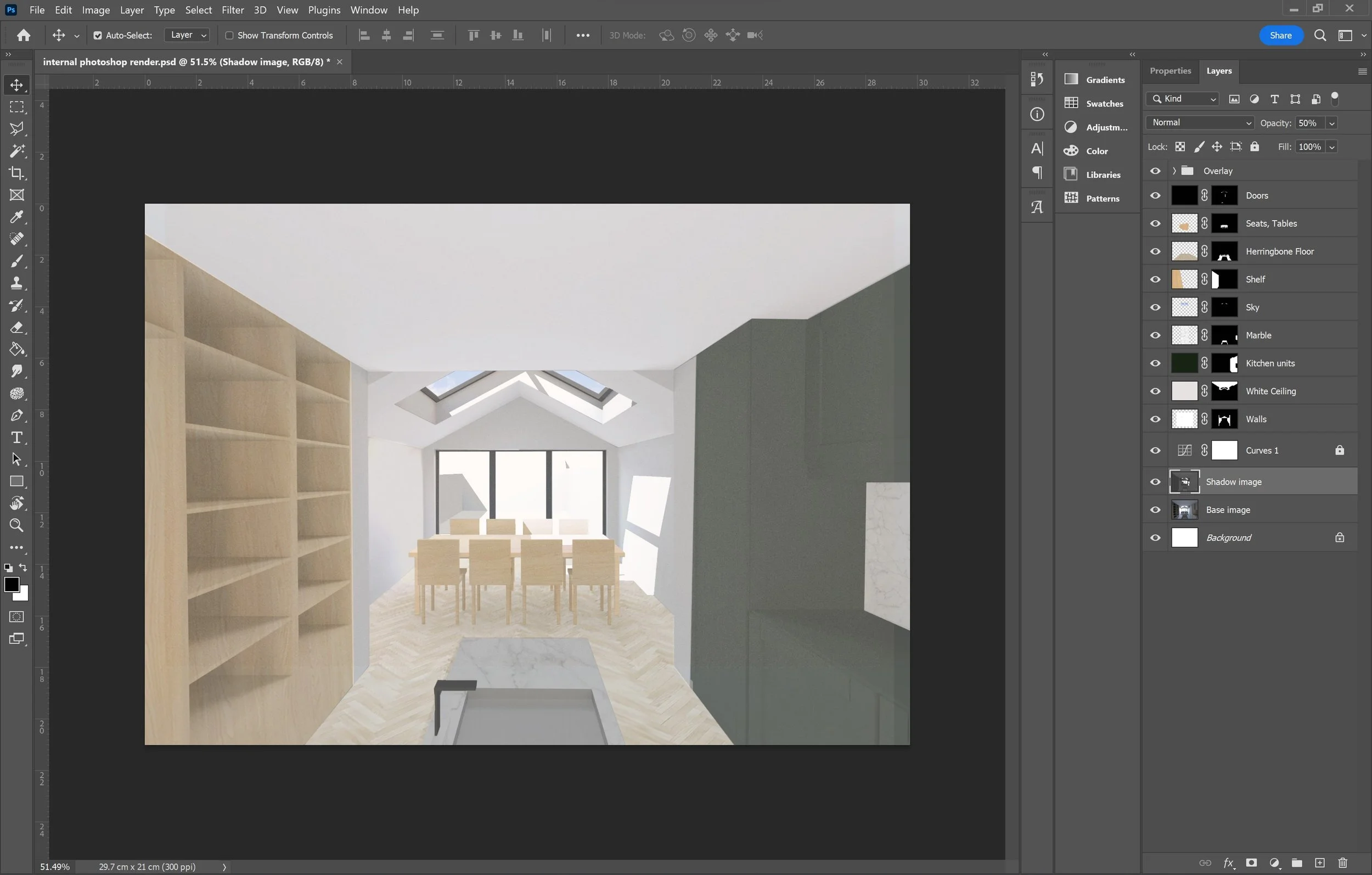
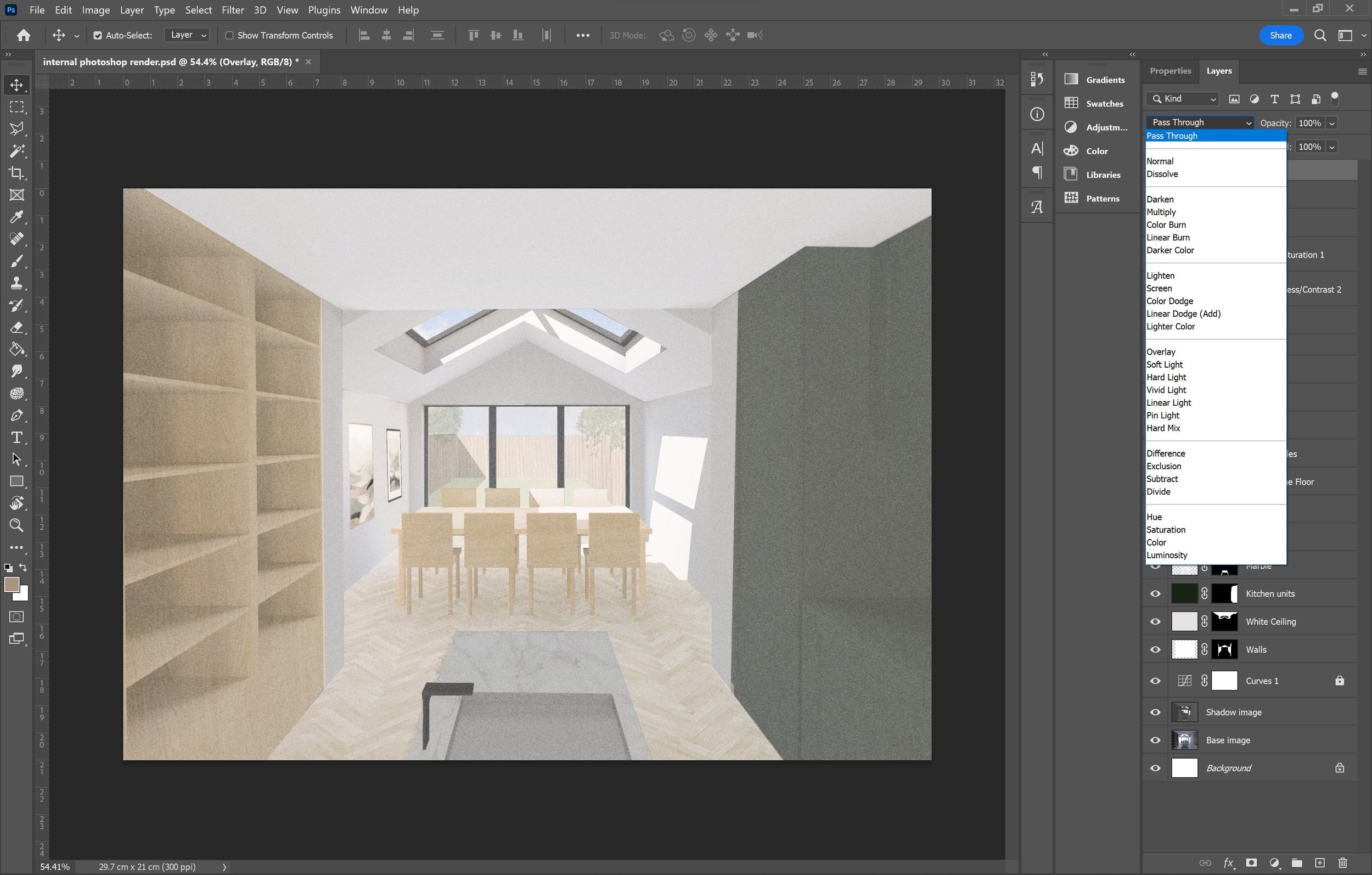
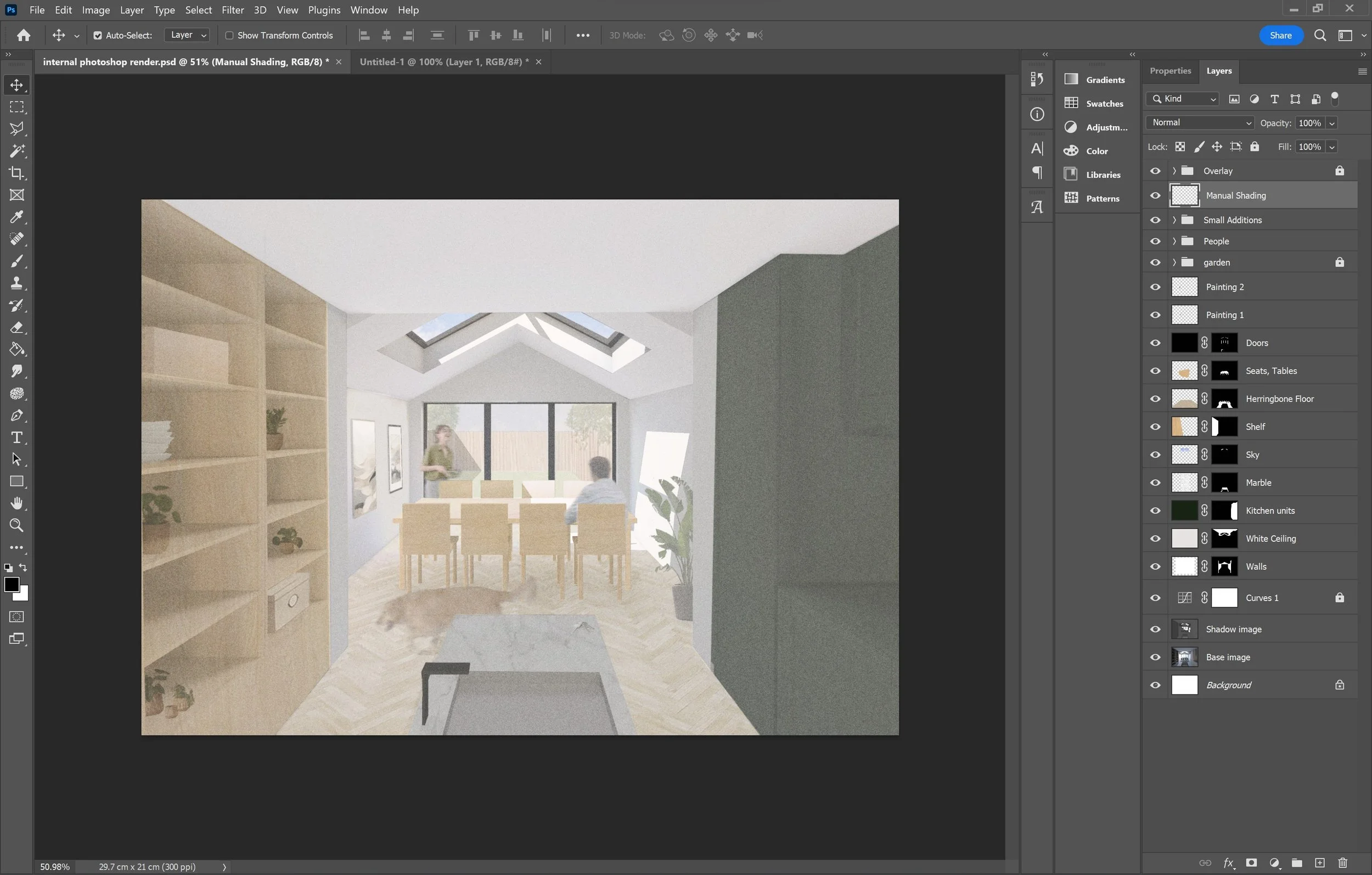
Now that you have a base and a shadow image, we can move into Photoshop. The first thing you want to do is define a suitable page dimension for yourself. Once you have opened this new document [5] you need to drag both selected images to the canvas without moving the placement and rasterize the layers [6]. If the image doesn't fit the page, you want to select both layers and adjust it to fit the canvas through the ‘free transform’ tool (Ctrl + T) [7]. Starting off with these images, I move the shadow layer above the base colour and dim the opacity of the shadows. I usually bring it down from 100% to 45-55% depending on the effect you are trying to achieve [8].
Brightening Layer
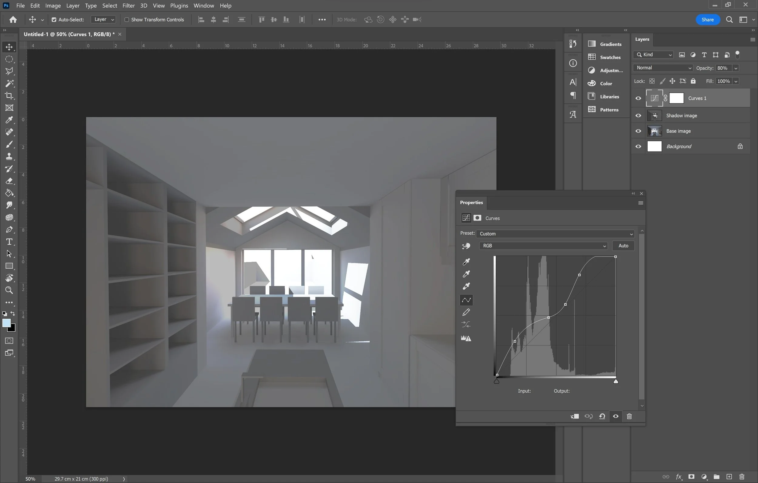
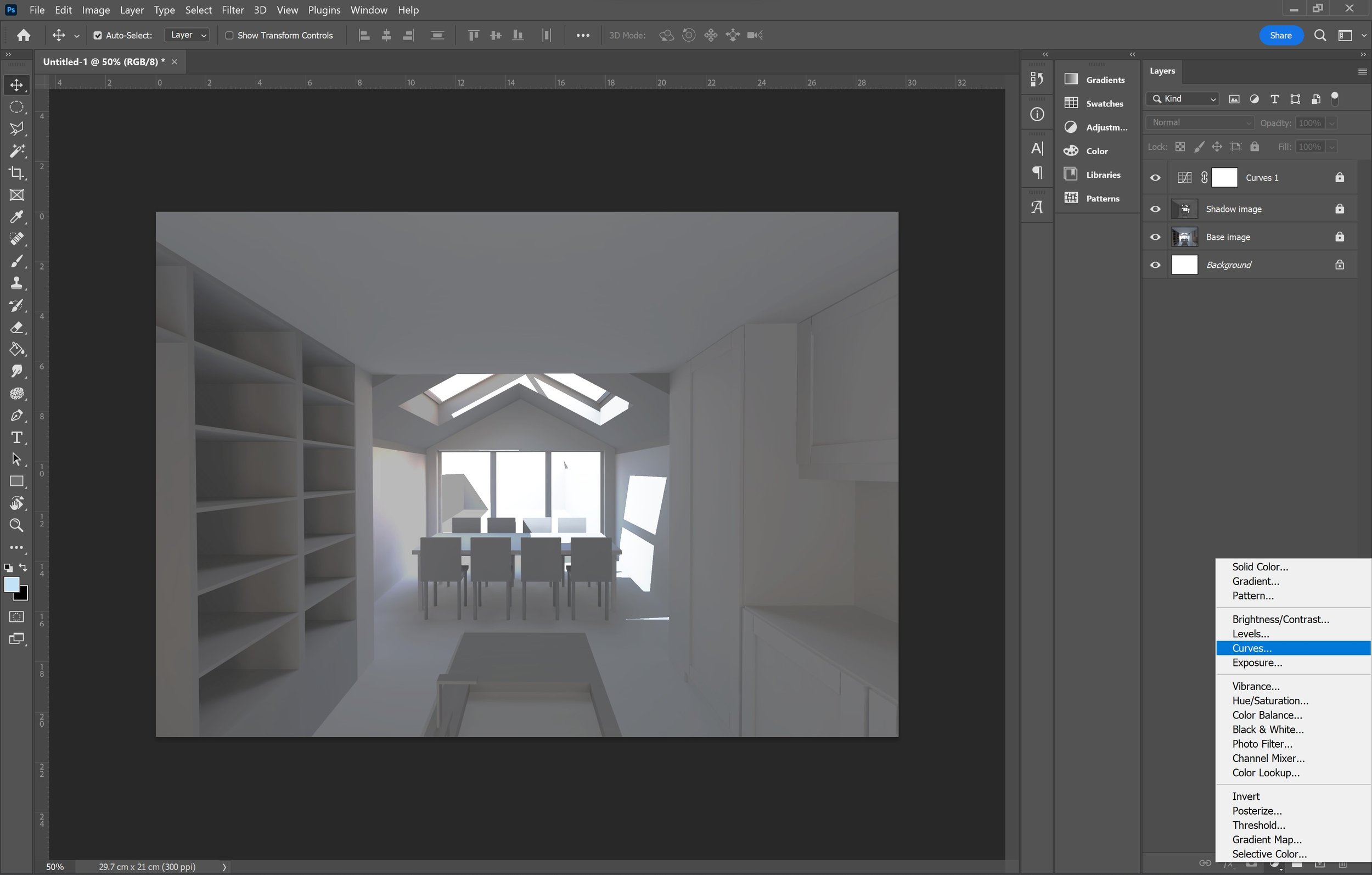
If you’re using a render image which has a dark background, like the example, I would advise you to set up the curve tool on a new layer to brighten the image before adding colour and texture [9]. The curve tool is used to adjust the image's tonal range by adjusting points on a graph. When you first apply the tool it should open the properties window where the graph will be linear. You then need to move the existing points to adjust the lighting to your own preference. The lower left side of the graph affects the shadows and the upper right side affects the highlights, working with the images tonal range to achieve a brighter look. To add this to your photoshop file, make sure you are not on any layers and select the half filled circle icon at the bottom of the layers panel to ‘Create a new fill or adjustment layer’ and select ‘Curves’ [10].
9
10
Masking
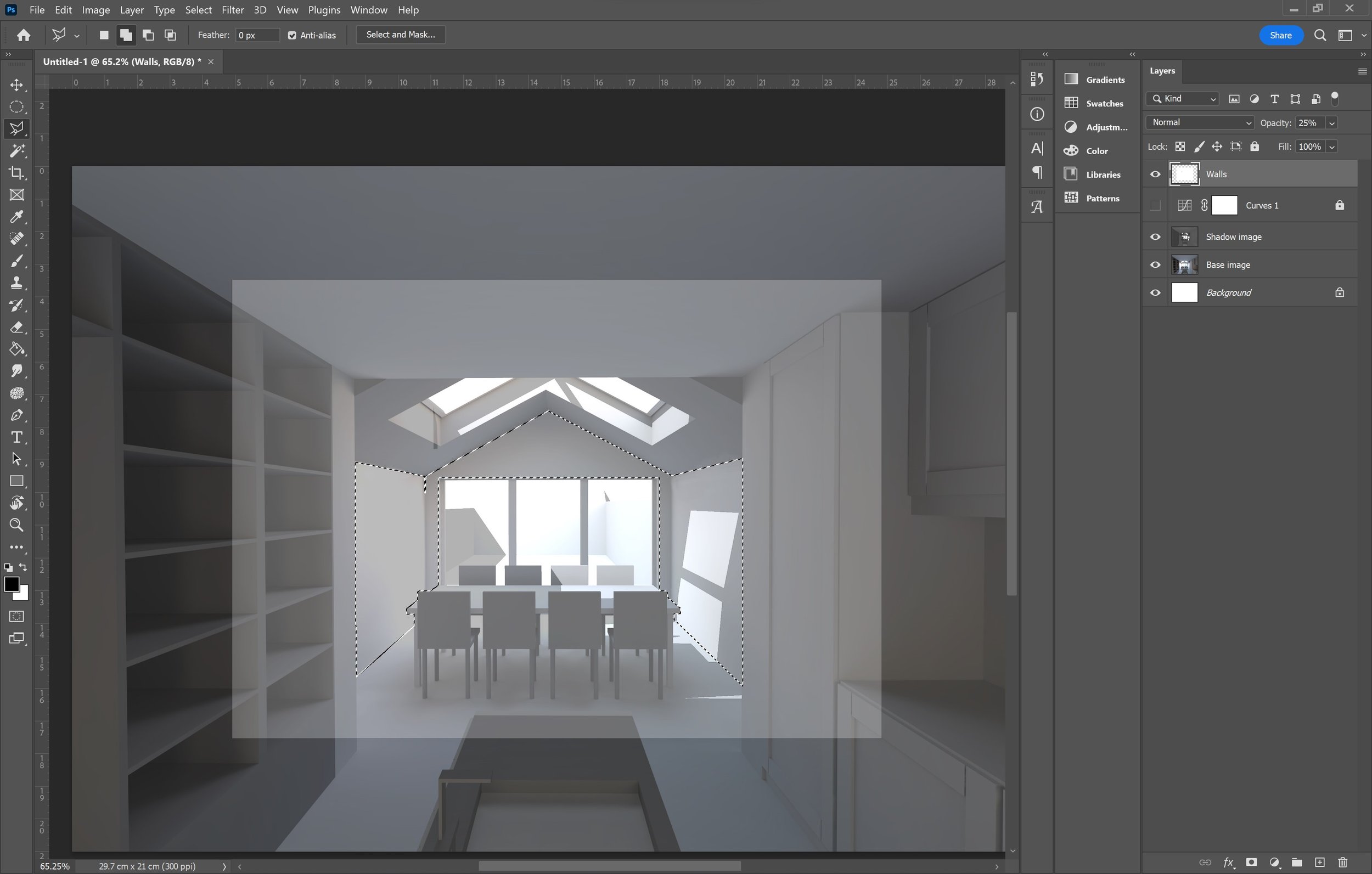
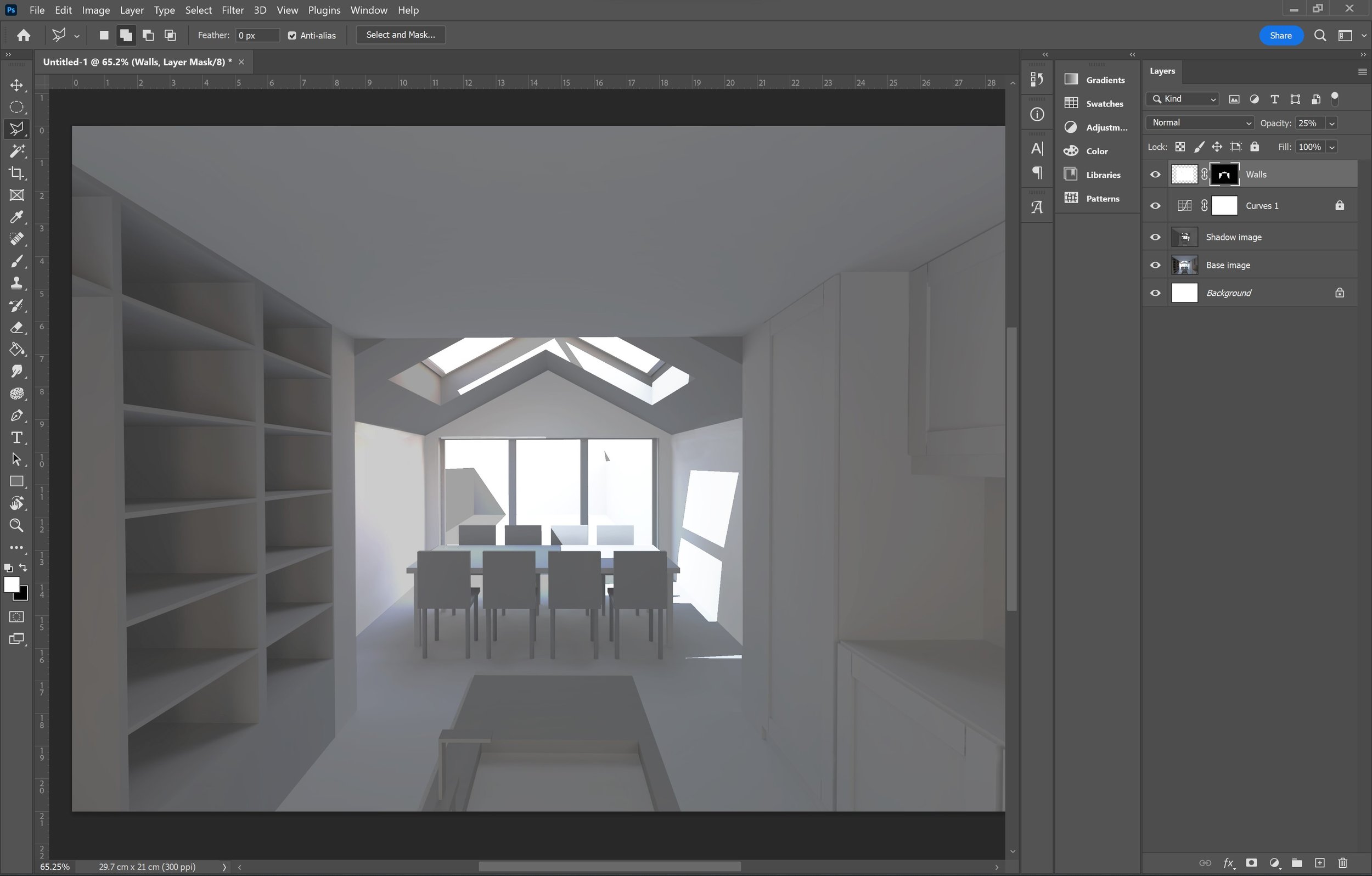
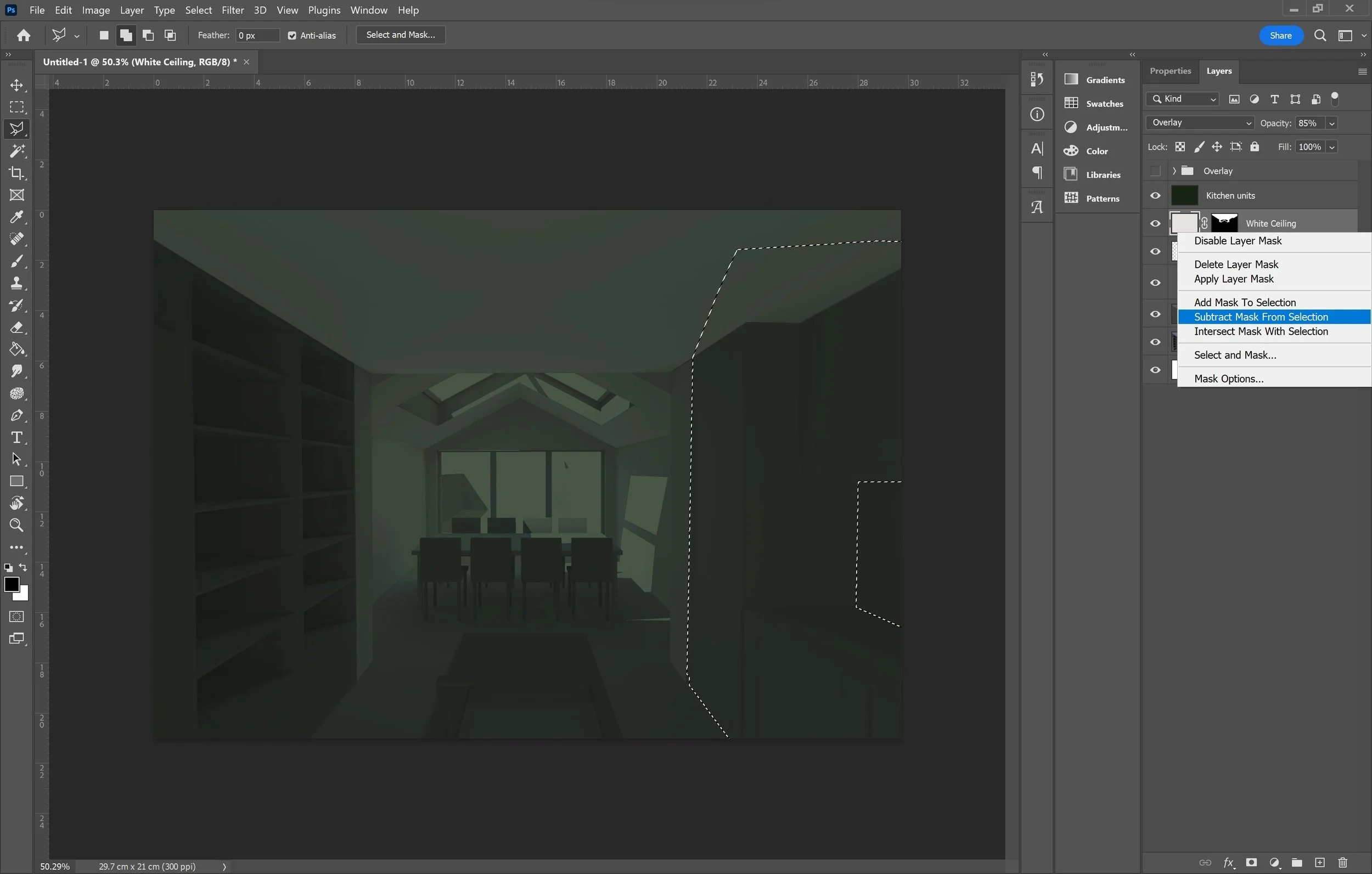
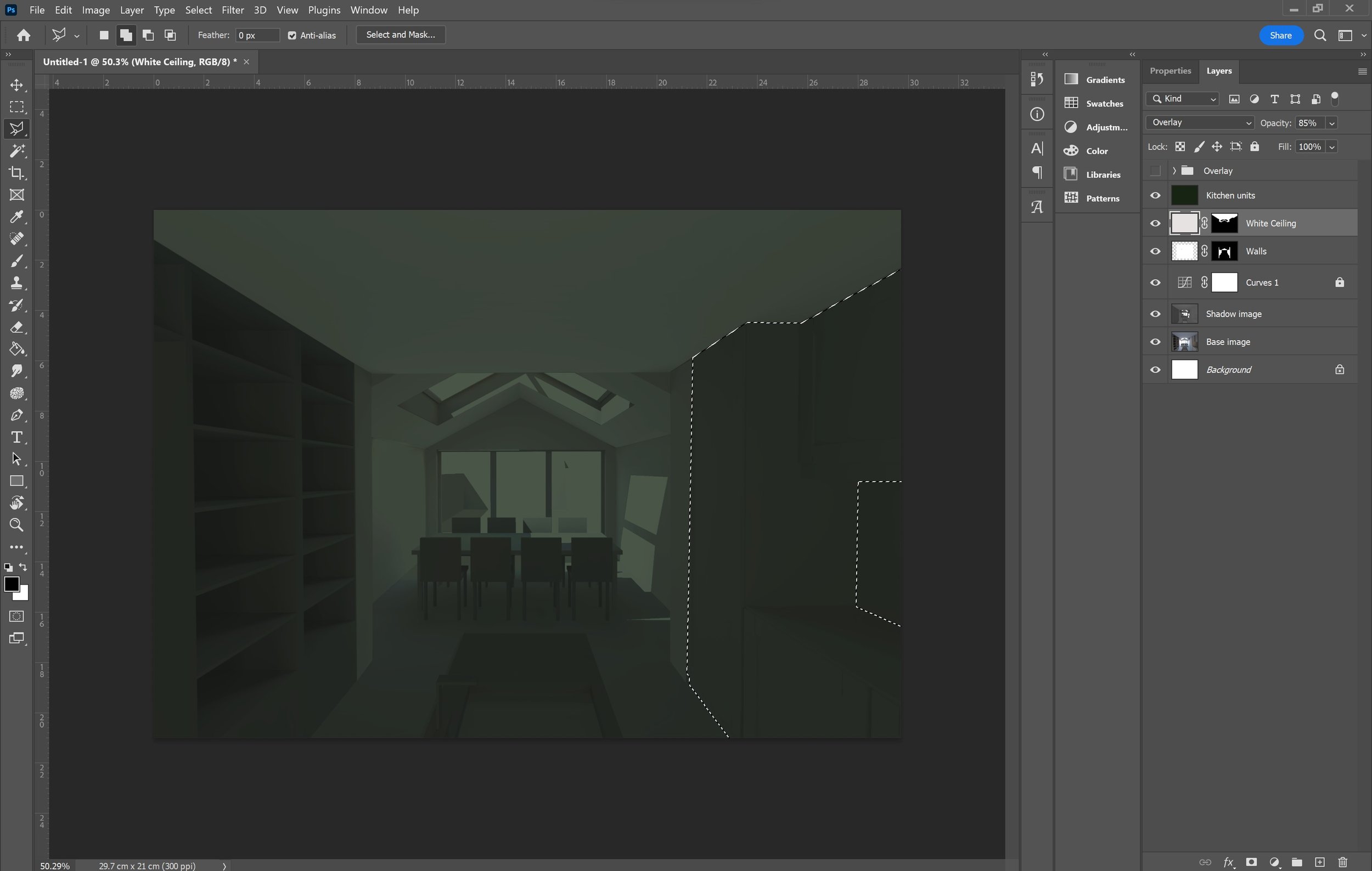
If you’ve read through our external render tutorial, you would have already seen how much we encourage masking over deleting so you are not getting rid of the texture or layer completely and you can bring it back into the view when you want. This tool is handy in a lot of situations, you need to select the areas you want to cover with the polygonal lasso tool and click ‘mask’ in the layers tab [11] + [12]. Firstly, try to use it for the layers which require a bigger surface area i.e the ceiling, floor, kitchen units [13] and then for the more smaller, detailed layers i.e dining table, chair legs etc [14]. One super helpful masking tip to quicken the whole process, is to use the ‘subtract mask selection’ option [15 + 16]. When you outline an area with the polygonal tool, you can subtract an existing mask, which immediately reduces the selected area more accurately.
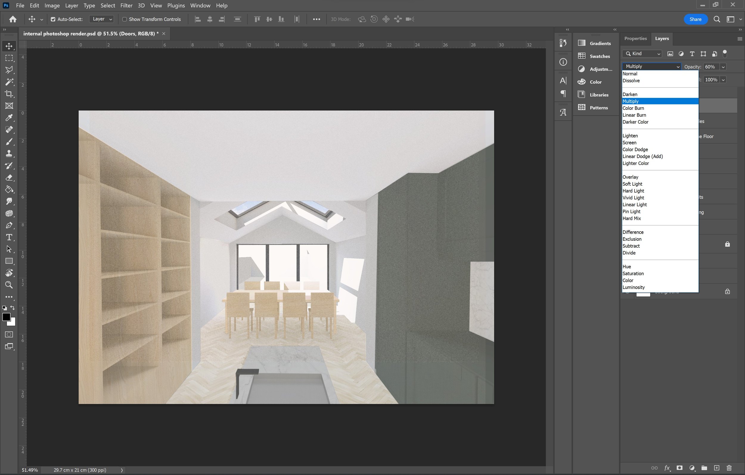
Other than this, when applying colours and textures, you should have a quick run through of the ‘blend modes’ [17] as it can really enhance the image. For the most part, I tend to use ‘overlay’ or ‘multiply’, usually the other options aren’t as helpful as they are too extreme, however still go through them as you might find one that fits your image well.
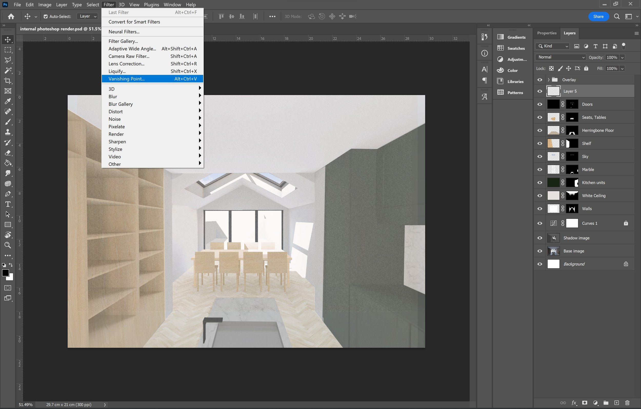
Vanishing Point
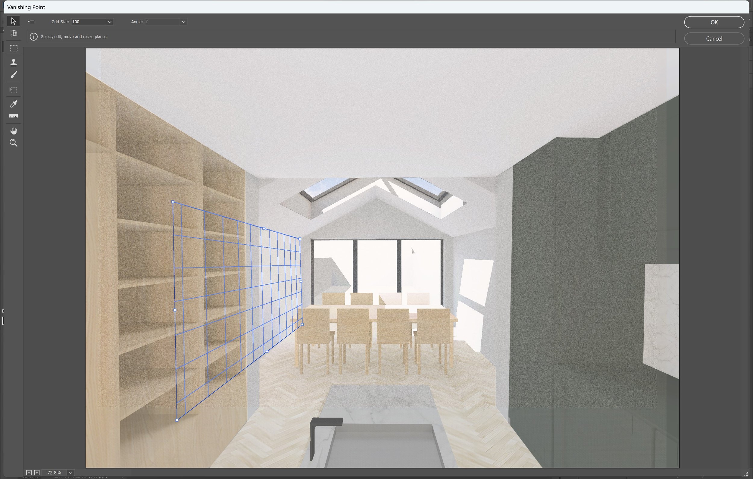
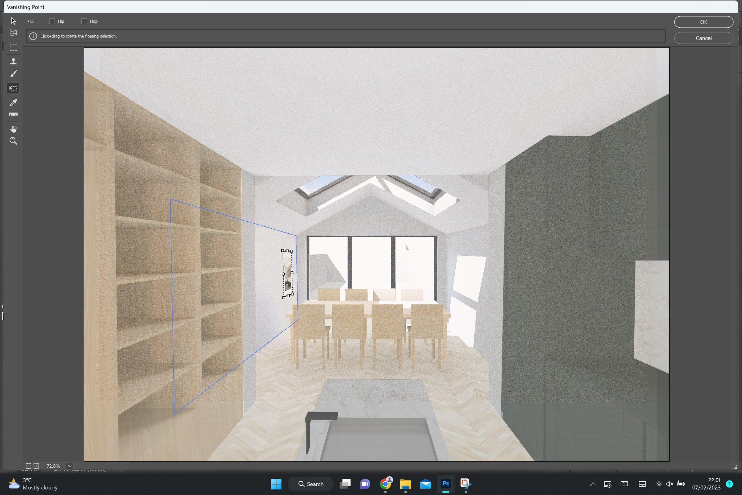
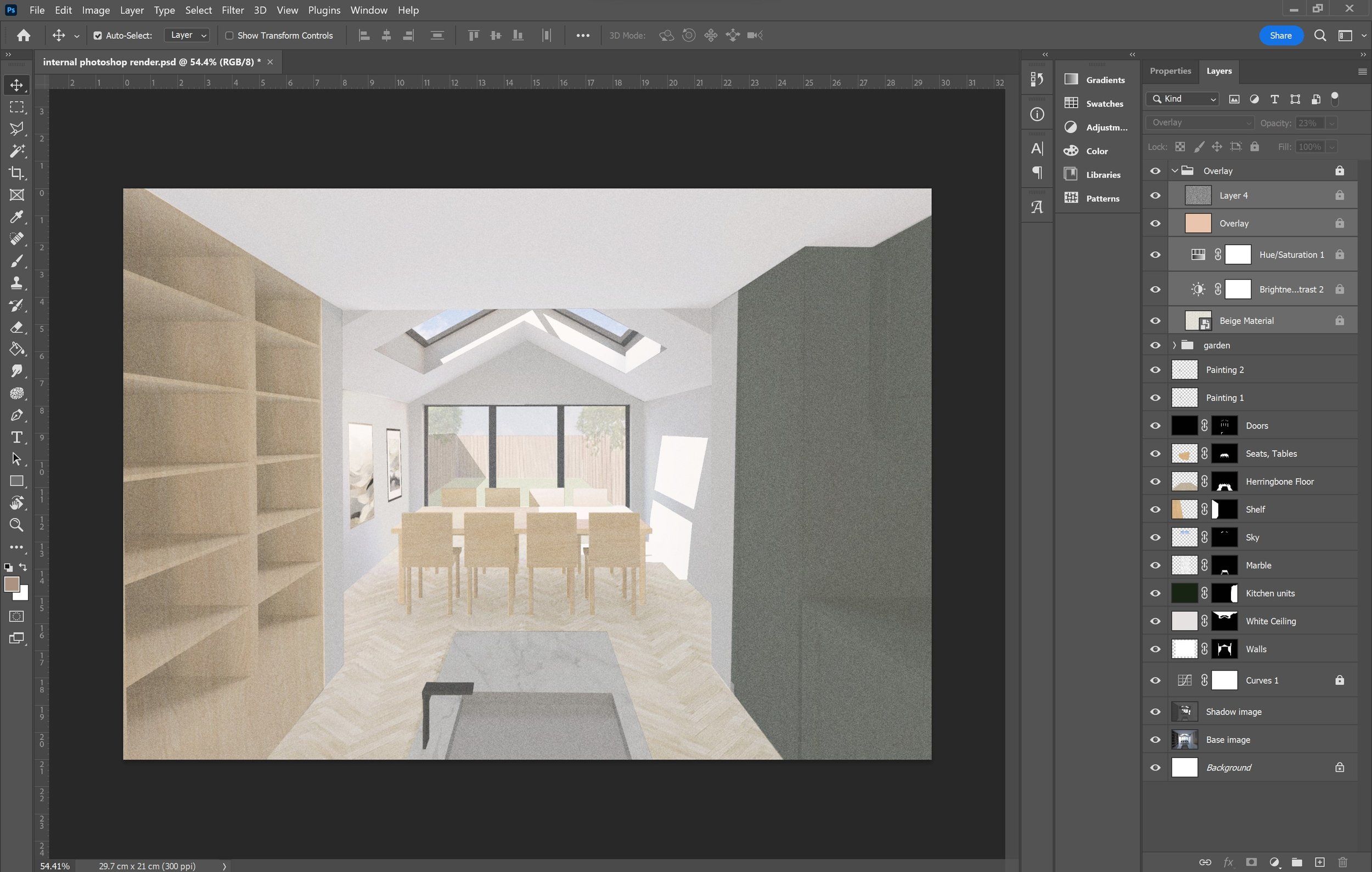
This tool is incredibly useful when adding in objects that need to be skewed or transformed, improving the accuracy of the perspective and reducing the time spent trying to make an object look like it fits in. Whilst you can do this through the transform tool I find it’s often very picky and difficult to get the correct angles. Here I’ve used the vanishing points to create the perspective of the paintings on the wall in the dining area. Firstly you want to create a new layer and select ‘Vanishing point’ from the ‘filter’ tab [18]. Now that the tool is selected you want to create a plane by selecting the grid icon [19]. Then you can Ctrl+V to paste the image you want in perspective [20] and drag it over the grid [21] which will automatically place the image at the correct angle. This is a very simple and practical way of placing something in perspective!
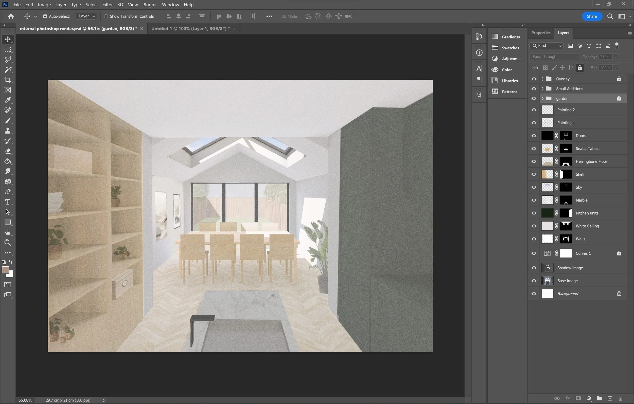
External Conditions
In this image you can see that through the openings we have a view looking out to the rear garden, which is an external condition. The simplest way to go about this is to create a garden folder with the necessary layers. This includes fences, shrubs, the sky, grass etc. and depending on how much of the external environment you can see, I like to touch up some of these layers and imported images using the brush and stamp tool. For example, if there is a wide span of grass that is exposed to the viewer because of a sliding door into the garden, to reduce the patchiness and sharp lines, I will go in with a plant brush that I have imported into Photoshop to add texture and volume. You can import a range of free and paid brushes into photoshop from various sites online.
Overlay Effects
As you might have already noticed from some of the screenshots so far, I usually like to apply a folder of effects to ‘tone’ the image and add to the visual aesthetic of the image [22). This folder of effects is what makes the style of the render look really good. These layers essentially add another brightening layer, a cream/beige colour overlay and a grain to complete the feel of the image. You can add or adjust the setting of an effects folder to suit your preference in style. I like to have a brightening layer using the brightness/contrast tool set between 40%-50% and a hue/saturation layer set between 20%-30%. In addition to this, I add a beige/cream coloured layer to soften the image and almost tie everything in the render together. Most importantly, I create the grain layer which takes it from looking like a basic photoshopped image to a quality render. I set the grain layer somewhere between 7%-12% and on ‘overlay’. Once all the individual layers have been created, I like to place it into a folder and use the ‘Pass Through’ blend mode to set it all in place [23]. You can see the difference here with overlay effects [24] and without [25].
22
24
23

25
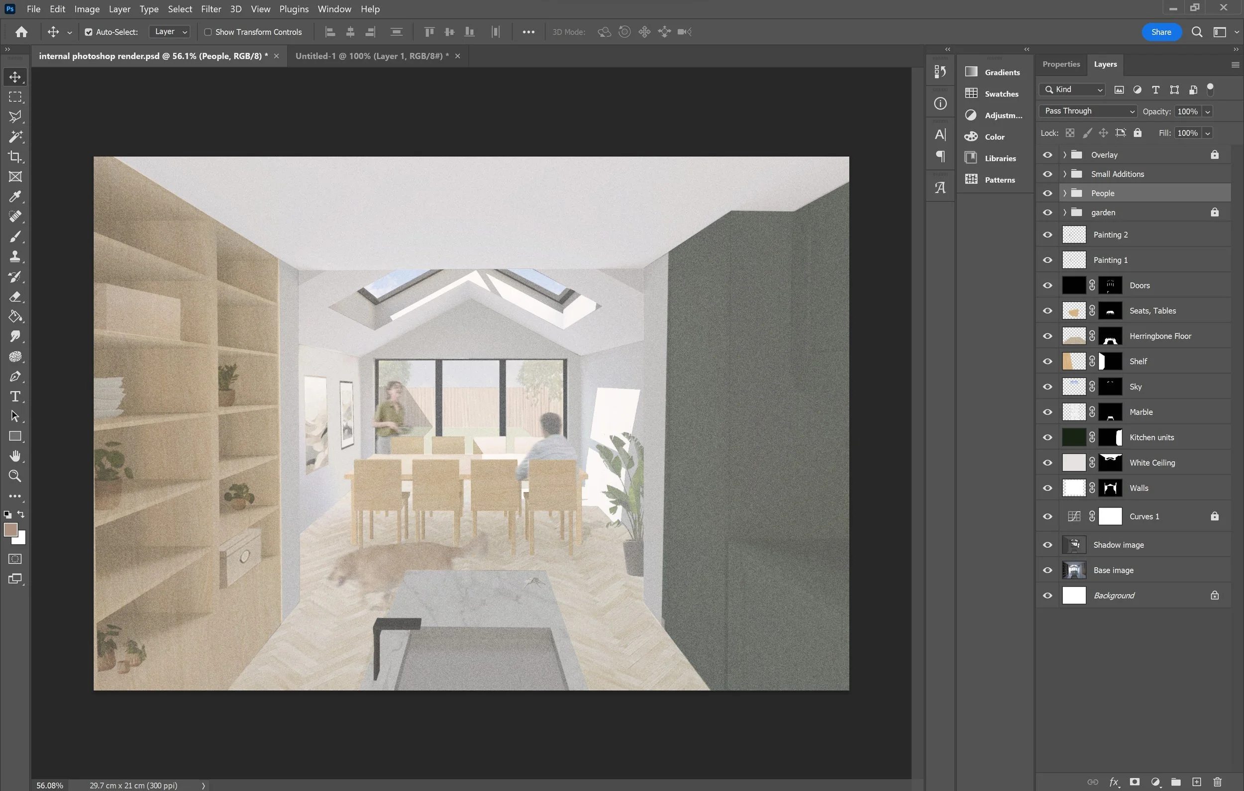
Final Small Touches
There are a couple final touches to add. The first detail is to add small trinkets, plants and household items that help bring the render from a basic visual to a more realistic scenario [26]. It helps to visualise how the space might be occupied and the experience of the space itself. Secondly you want to add in people to populate your render. In the same way as when you add people into your CAD drawings, you want to include rendered people to bring the visual to life. Depending on the style I am aiming to achieve, I will sometimes use the motion blue tool to create a moving effect [27]. Lastly you want to manually create shadows with the brush tool [28] . Whilst we have most of the shadows provided with the ‘shadow image’ we generated from the model right at the beginning of this tutorial, when all the textures, colours and objects are added I would go back in to the file with a new layer and add in subtle shadows with the Soft Round Brush, on a small brush size, 25% hardness, 5% flow and 60%-75% opacity. I apply this shadow typically where two surfaces meet, on textures and to all the objects I’ve added in photoshop that were not included in the original model.
26
27
28
Final Render
Now that you’ve worked your way through the whole tutorial, we hope that you will apply all these efficient tips and tools into your Adobe Photoshop workflow, when you next create a render. Don’t forget this is a specific style and you can use the tools differently to achieve your own aesthetic! For more of our content, go over to our instagram @archidabble
Remember to always tag us on Instagram and use our hashtag #dabblefeature in order to have your work shared on our story with the community :)