
Making a Website Portfolio
On Monday, over on our Instagram, we covered some beginner-friendly website builder options for those interested in upgrading their portfolio. Psst… I’d recommend checking that post out here before reading this post :)
We will be covering topics such as what to include in your portfolio, mistakes to avoid and the initial steps of generating a website considering you do not know how to code. If you know how to code… well that’s a different story but do keep reading to see what advice we have to offer.
Picking a Website Builder
Now, I didn’t mention checking out our Instagram post from this week for no reason. For those of you who may find it overwhelming to start learning how to code a website or just do not have enough time to do so, the next best option is to pick a website builder that ticks all your boxes.
Some of the ways in which you can deduce which website builder option is best for you is by breaking a website into different categories;
- Layout
- Coding Extras
- Flexibility
- Subscription Price (most website builders come along with a set of fees)
- Domain
+ more
To briefly expand on these points, ‘layout’ refers to the templates that come along with the subscription fee that you pay for the website builder. Does it fit the type of website you are going for? Is there a wide range to choose from or only a few? Are you able to adapt the layout to your liking or would it better to start from scratch? All in all, the ideal case is to use as much of what is provided by the website builder in order to make the process easier.
Interactive features such as an ‘online chat’ function or pop-up quiz to direct the viewer to certain areas of your portfolio website would be considered as components of a website which are more complex, and so it is likely that you may need to code some of it which brings up the question of whether or not the website provider allows you to add your own coding functions to change a template.
‘Flexibility’ is a general point across the board when it comes to designing your own portfolio website - how much visual design control do you have? We think this is a genuine deal breaker with a website builder since it’s only natural to not like everything about a template layout so you would like to change some things around. Will it be a matter of simply dragging a photo anywhere you want or are you limited by sizing and alignment options? Do your research!
The next is quite self-explanatory… subscription fees. Set yourself a budget and look at what options fall into it. Another fee-related deal-breaker that you should consider is your cancellation policies. Ideally, you should look at plans or subscriptions which allow you to make alterations without having to drop a big fee to cancel or end your subscription early. Especially, if you find yourself unsatisfied with the services provided.
Along with designing a website comes a domain. What we have realised is that typically, an additional fee is expected from customers when determining their own personal domain name. This is not always the case but put extra care when choosing your domain name as this is essentially what is in the search engine. Make it clear and straight to the point.
For example:
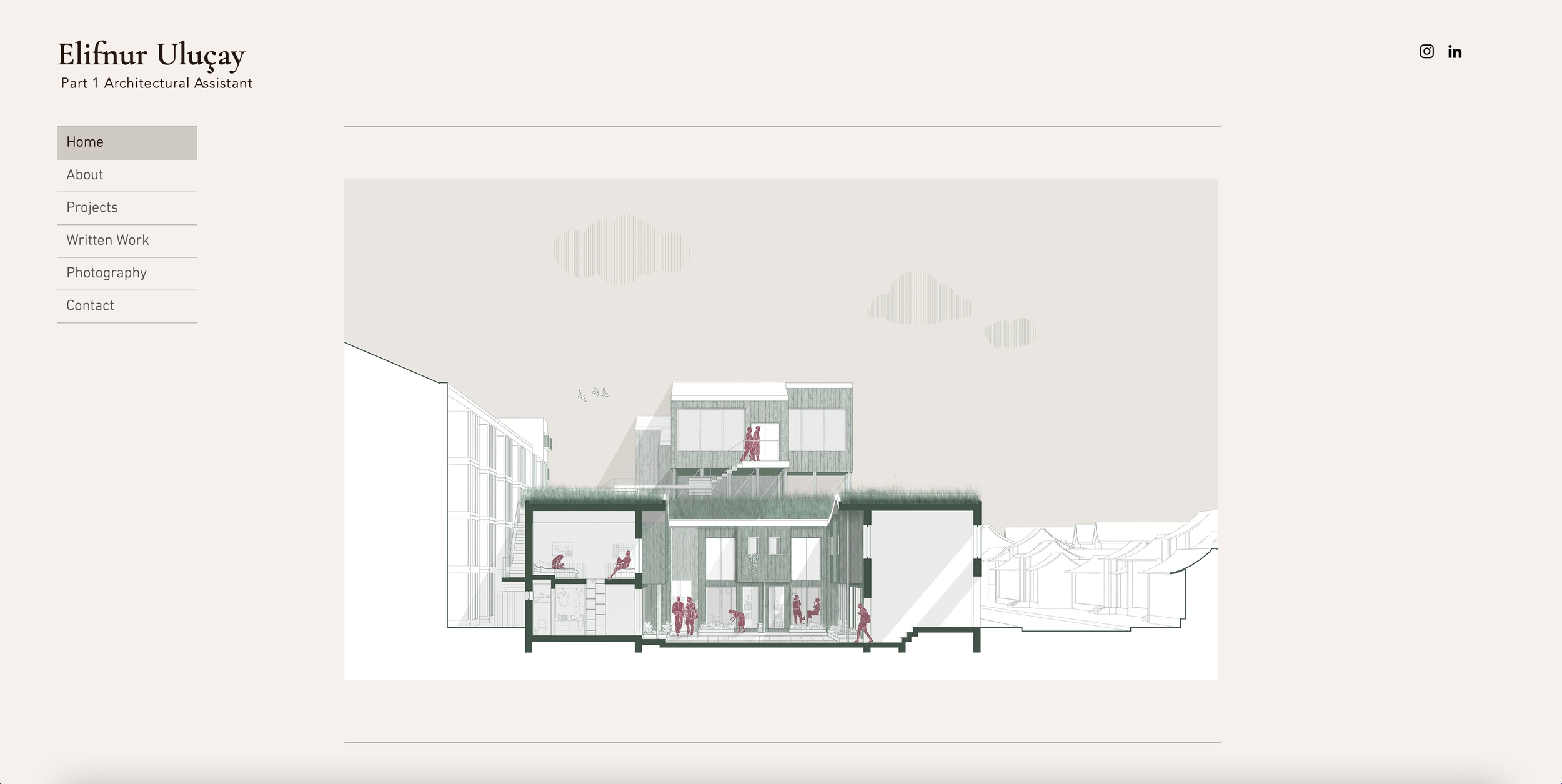
A website builder service we are familiar with is Adobe Portfolio. When making a website portfolio for a compulsory submission in our third year this is what Sude used. The domain for the website was extremely clear. However, the service does limit the domain format. In the case of Adobe Portfolio, you can customise the first half of the domain (see short video below).
[insert text].myportfolio.com
Credits: Adobe Portfolio Website
In this scenario, we would recommend placing your name in the domain as the remaining part already suggests what the link will be taking you to. If you opt for a different service which gives you full freedom over the domain, the best advice is to not overcomplicate it. If you already have a domain supported by a third-party provider, you also have the option to connect it to your Adobe Portfolio as Adobe does not host full domain names as of right now and instead uses sub-domains.
Look for References
It can be quite overwhelming to start designing a website from scratch so we would highly recommend for you find some precedents. Check the portfolio links from your fellow LinkedIn connections. That’s somewhere people share their portfolio links with potential employers. You do not have to look at architecture portfolio websites specifically either, feel free to browse through portfolio websites of different professions too. Since we are not focused on the content on the pages it doesn’t really matter what the website is displaying, we care more about the visual aesthetic.
What to Consider & Avoid
Now, sit back and relax because we have a lot to go through when it comes to the nitty gritty of designing your website. Remember that much of the advice given in the next set of areas will sometimes be based on personal preference and should at least inform you about other criteria to consider and act on in your own way.
Colour Palette
Just like the PDF portfolio, you need to show extra care to the colour palette of the website. Some ways of tackling this can be;
- Matching the colour palette to the colour palette used in your work
- Generating a complementary set of colours that work alongside the content you will be putting on the website
- Opting for a monotone approach (white is not all that boring if executed correctly)
- Use our Adobe Illustrator tutorial on using ‘Blend’ to generate a colour palette, which you can find here
Remember that these colours can change and need to be reviewed over time as you update your portfolio. We would suggest making sure to not overpower the content by using flamboyant colours or clashing tones as they may distract and worst case scenario be intrusive for the eye and instead of commenting on the hard work you have displayed, the viewer starts criticising the website.
This is not what we want, you are not a web designer… you’re an architecture student/graduate so do not let them ponder on areas that you are not trying to bring light to. It may seem basic but a simple white backdrop will solve the issue. Yes, it may be overused but that’s because it works so well. You want your work to speak not the aesthetic teal gradient that runs behind the headings.
Credit: Dezeen Website
Layout
This… do not underestimate the importance of layout. Over time, I think it's safe to say that architecture graduates adopt an eye for detail. We can definitely say that when you come across botched alignment… :| So many connotations come along with it; laziness to detail, no strategic laying out, no visual story, and even lack of confidence.
For example, if your work is presented in noticeably small sizes and overpowered with paragraphs of text, the first thing that comes to a viewer's mind is either that you think your work isn’t good enough and you’re trying to cover up mistakes, you lack the skill of having a visual hierarchy or everyone has supervision. There needs to be a balance between text and images along with consistency. This doesn’t necessarily mean a 50/50 division, but what works best for your selection of work.
Since architecture prides itself on being a visually stimulating field, it only makes sense that your work does the talking and the text is just there for backup. Just like how this is the case for a PDF portfolio, it’s the same for your website. A crisp set of 1-3 content page layouts will go a long way. Apply these across your website and that should avoid any odd-looking anomalies and keep the consistency.
The same principles apply to alignment and spacing. The spacing between a heading, sub-heading and main body of the text should be the same across all project pages: It makes no sense for it not to be. Sizing of text boxes and images is also not the only way to create a hierarchy. You can do this with spacing too. Some simple rules of thumb:
- A large spacing (2-3 lines) between 2 paragraphs suggests that 2nd paragraph will be introducing a new topic about the project
- A smaller space setting should be used between a sub-heading and the text following on from it
- Between two different sub-heading paragraphs, there should be a space setting larger than that of a sub-heading and corresponding text but less than a gap between 2 different headings
Didn’t think it would be this intricate? As much as these changes may seem minor, it’s only when there isn’t a basic rule followed throughout the whole website that these inconsistencies start to stick out. Check the example below and look at how all the spacing between the different purposes of text is not the same. Some are closer to each other, a good exercise might be to dissect why one is closer to another.
Credit: Architectural Digest Website
Navigation
Ease. That is what we want to achieve. Simple links between the different areas on your website. The best way to ease the process of finding something specific on your website is by coding in or adding a search engine tool to your website. This won’t answer all your navigation issues as you still want people to explore your website rather than taking a narrow route. For example, make sure that the title of your project is an active button that is linked to the project page and not just the thumbnail image behind it. If you decide to make both the image and the title a link, make sure to keep this uniform across your whole webpage to avoid confusion for the viewer.
To avoid these hiccups, just make sure to be constantly checking your website in preview mode or once published before someone else comes across your mistakes. Another shout would be to ask a friend to try and navigate your website before publishing! It’s a tiny mess up that can cause someone to not be able to view a certain part of your website and all in all end up in them- *closes tab*
Work Selection
As mentioned in our collaboration post called ‘Creating THAT Portfolio’ with @thearchitorture, you need to be selective with which work you choose to put up on your website. It shouldn’t be surprising to hear that you should use your best work: The work that gives a viewer the best overview of your strengths and what you are capable of doing.
Something about an architecture website portfolio is that you can slightly venture into presenting some other creative work. Typically you would already have a portfolio ready in PDF format to send out to employers along with your CV with a link to your website portfolio. This is your chance to show extra things about yourself - photography, art, graphic design, physical models, literature (like your dissertation), etc. In the case of applying for an architectural job, maybe another creative outlet would be worth considering to display!
Links
You could consider this category similar to the points made under ‘navigation’. Make it easy for the viewer to access your other media outlets. If you have a LinkedIn account, Instagram portfolio, professional email or any other websites/platforms which display you as a designer, make sure to have these linked somewhere on your website.
This would usually go on an ‘About Me’ or ‘Contact’ page. Even better if you can have your links appear in the same place across your whole website. Remember what we said, ease meaning make the process as fluid as possible so they are not having to flick back and forth for something that can be on all pages.
Visual Content
The quality of your work, images, videos, etc need to be top notch. The last thing you want is someone coming across your amazing axonometric drawing that took 30+ hours looking like a YouTube video when it drops from 4K to 360p. Research into media upload limits with the website builder you are working with and figure out ways to work around it. Consider the original aspect ratio of your work and whether or not it needs altering to fit the layout that you have designed or vice versa.
Additionally, simply pick your best work. The best drawings that demonstrate your capabilities. It’s better for the project to be explained in a series of 3-5 drawings rather than overloading all your submission pages onto the website and creating a never ending scroll journey.
If you’ve made it this far, give yourself a pat on the back :D
Creating a website so it’s brief but encapsulates most if not all of your architectural talents is difficult. On top of all that, it needs to be visually pleasing too. The intention behind today’s post was to give a detailed introduction to beginners on website portfolio design and help to avoid the rookie mistakes that we ourselves have made or witnessed.
Alongside today’s post, there is much other portfolio-related content on our blog and over on our Instagram, which you shouldn’t miss! Whilst you’re there, might as well also give us a follow :)
Oh… did you know we also have a CAD store filled with a ton of different packs ready for you to download? no…?
Tut, tut… scroll back up -> top right corner OR… click here
Remember what we said… ease.